Paper + Cups. A Unique Cafe Experience.
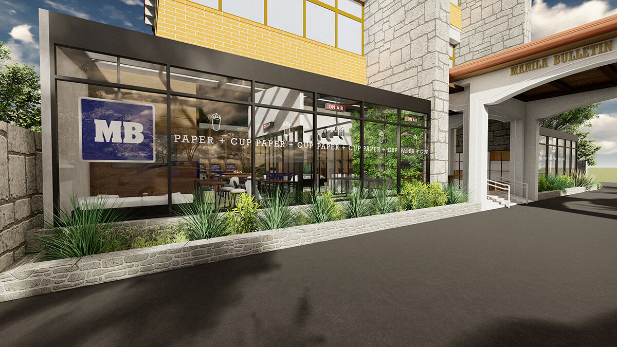
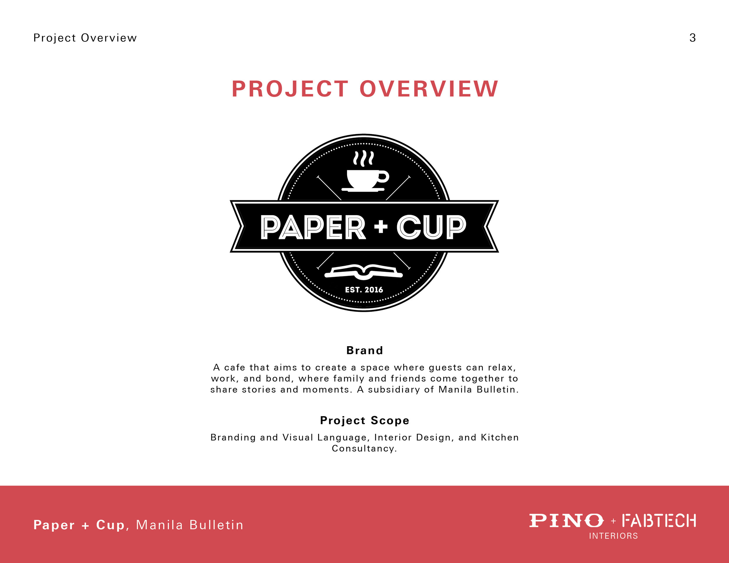
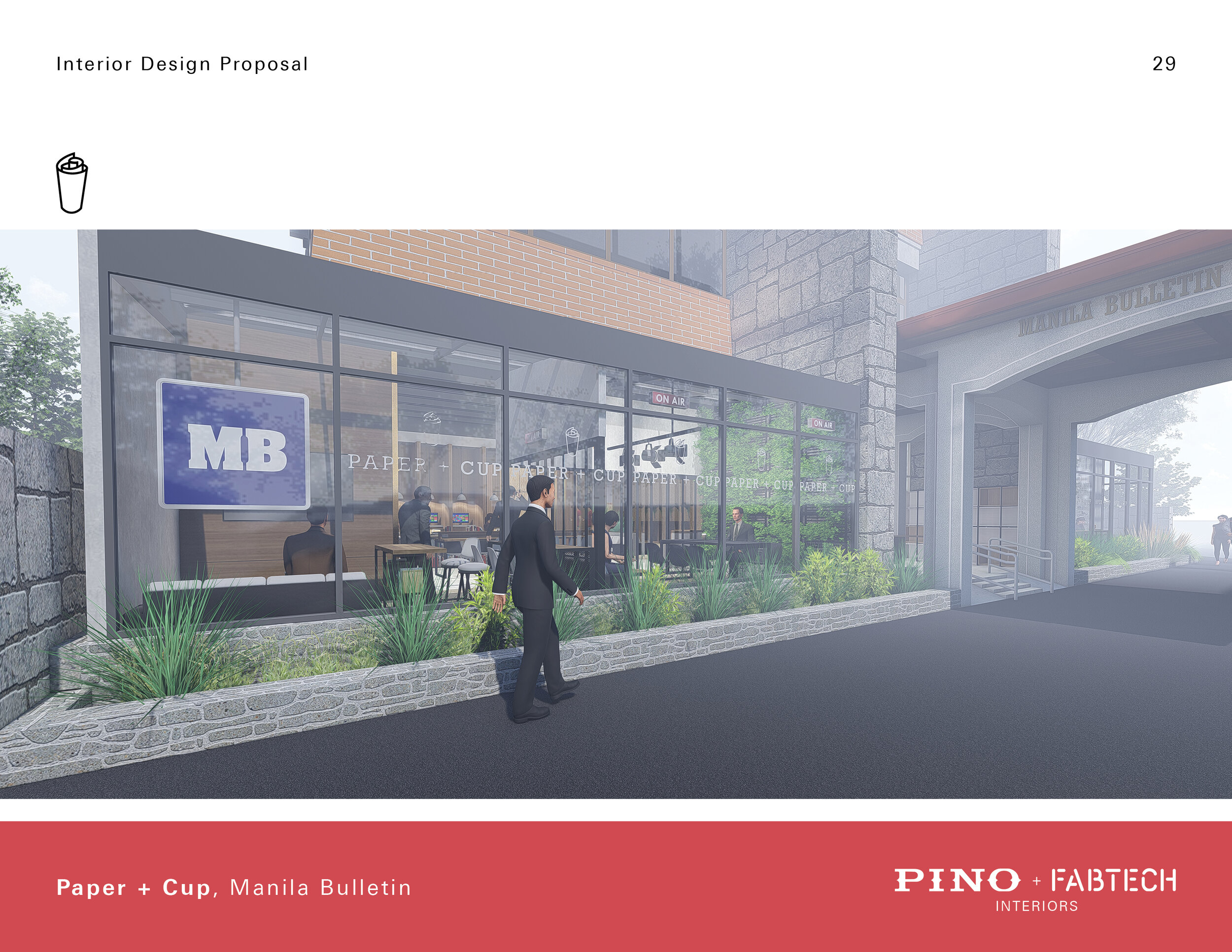
Paper + Cups is a café concept by Manila Bulletin, which aims to create a space where guests can relax, work, and bond. Since it is a subsidiary of Manila Bulletin, it acts as a new anchor to welcome younger audiences to the 120 year old broadsheet newspaper. The cafe space will be located at the lobby of Manila Bulletin which is a now a heritage site in Intramuros Manila.
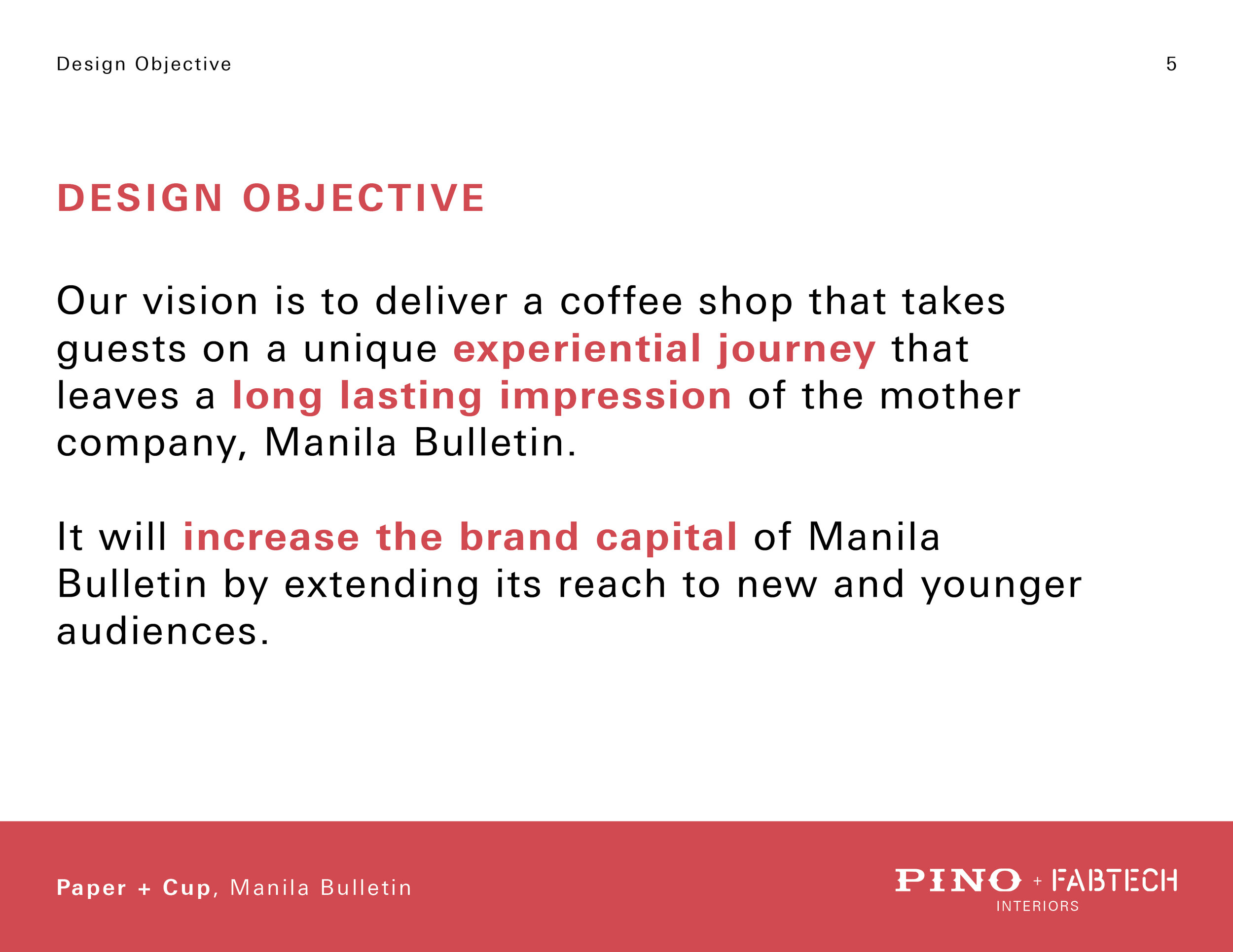
The vision that we came up with for this project is to deliver a coffee shop that takes guests on a unique experiential journey that leaves a long lasting impression of the mother company, Manila Bulletin. It will increase the brand capital of Manila Bulletin by extending its reach to new and younger audiences.
Design Requirements
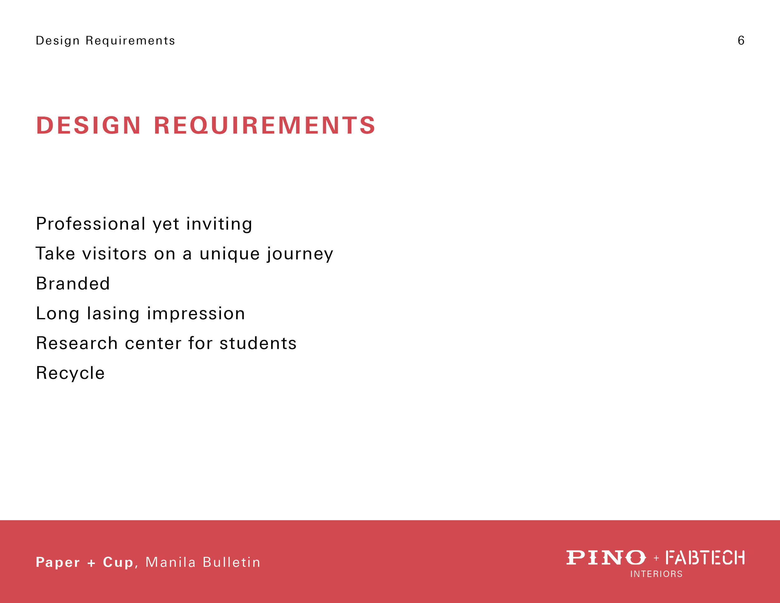
Professional yet inviting
Takes visitors on a unique journey
Highly branded
Long lasting impression
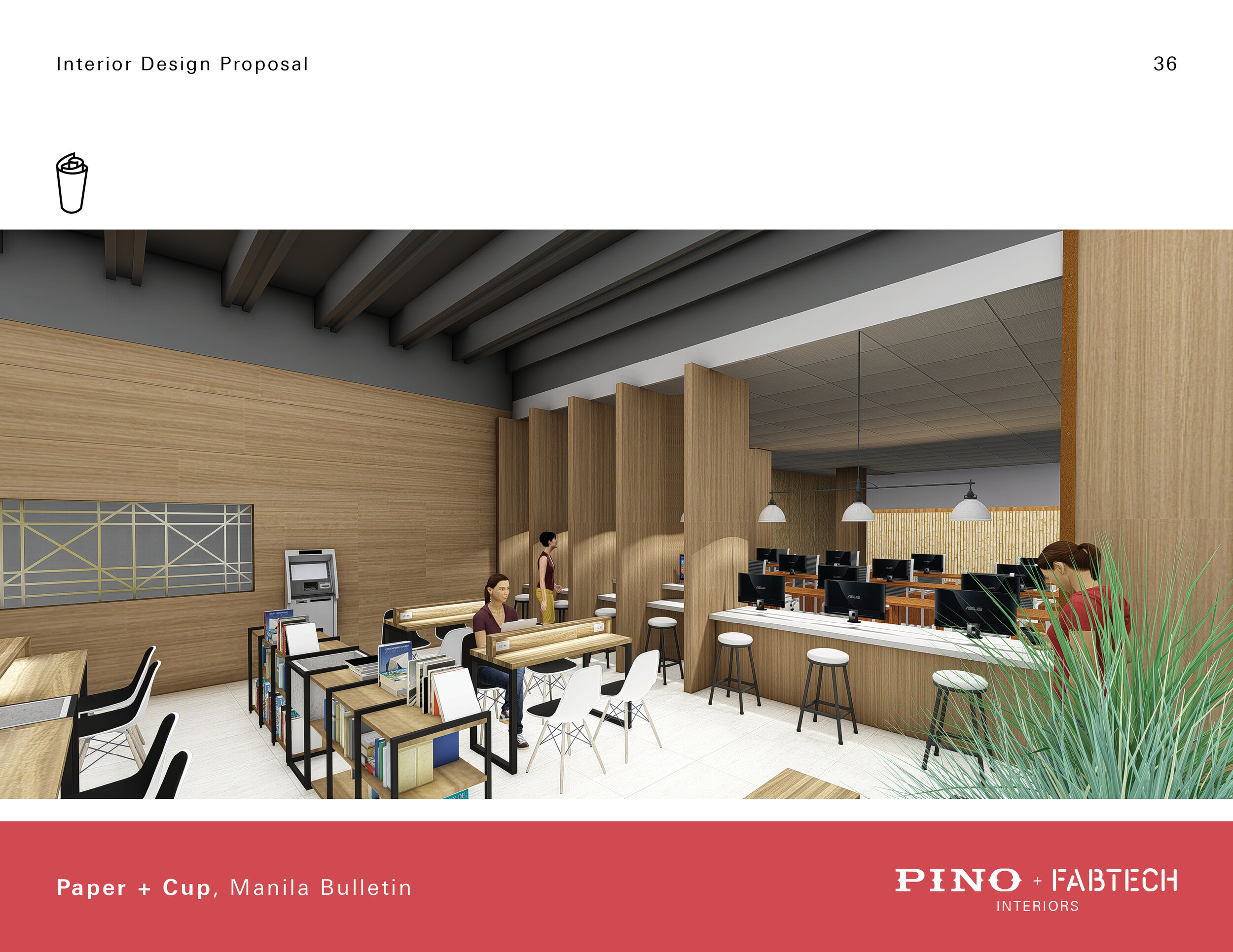
Research center for students
Recycle
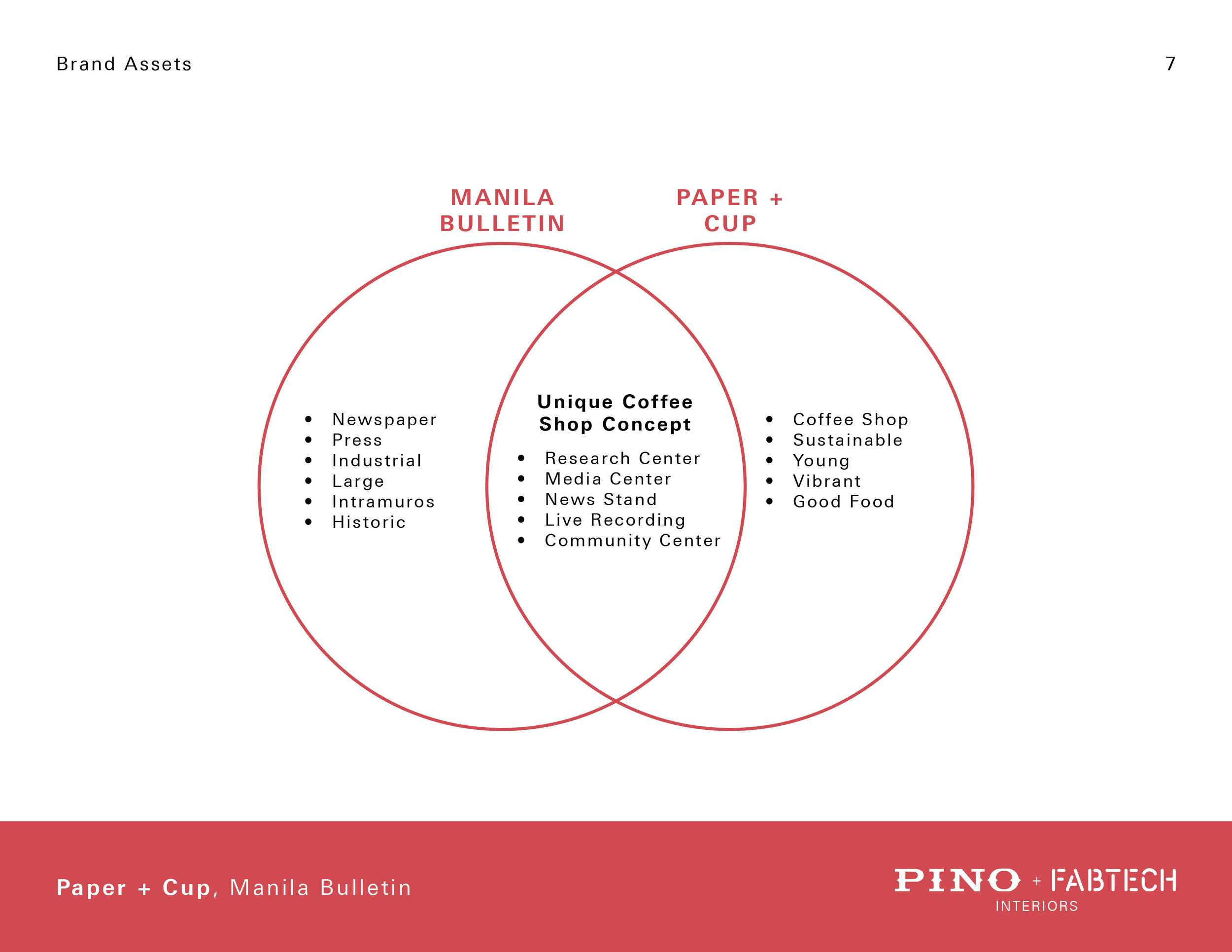
The combination of a newspaper media company and a café offered a lot of unique concepts that are rarely found in cafes.
Previous Logo

BRANDING DESIGN PROPOSAL
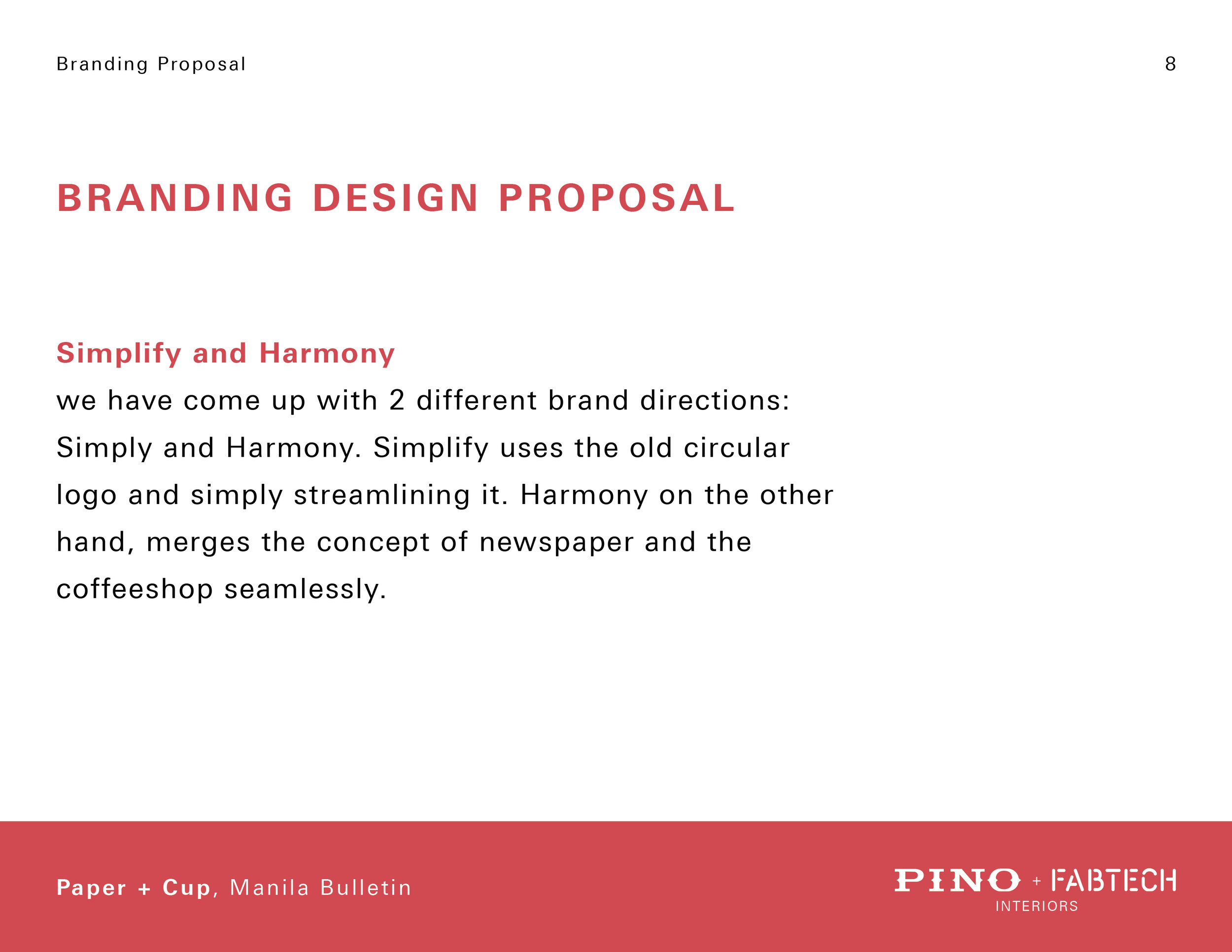
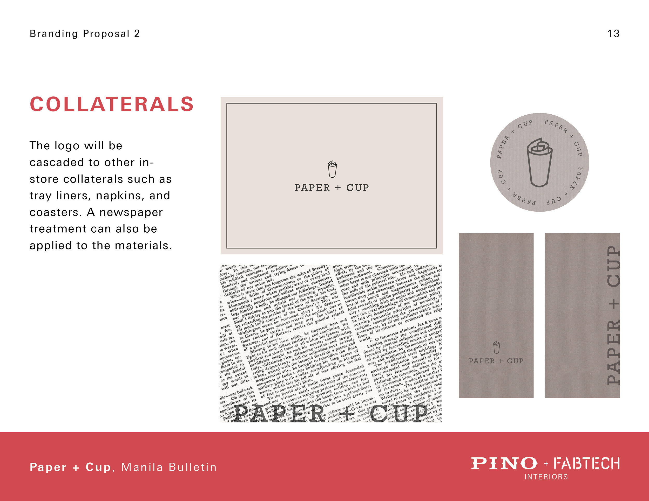
Brand Proposal: Simplify and Harmony.
We came up with 2 different brand directions: Simplify and Harmony. Simplify uses the old circular logo and simply streamlining it. Harmony on the other hand, merges the concept of newspaper and the coffee shop seamlessly.
Simplify.
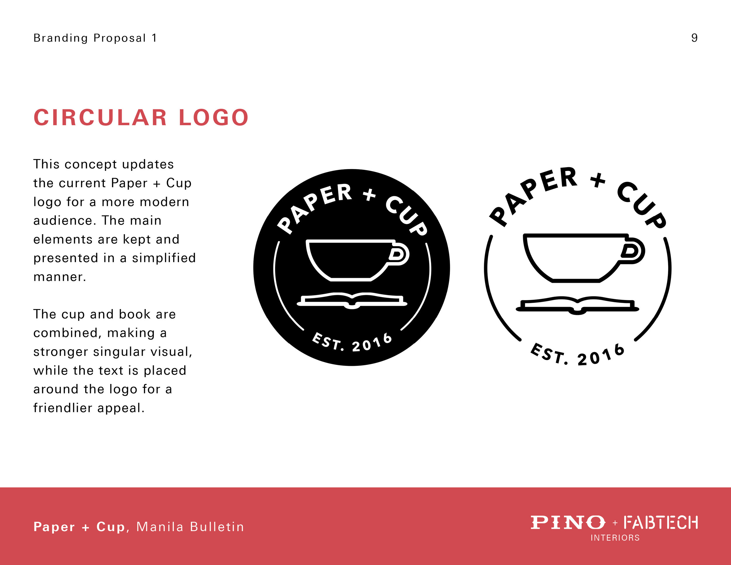
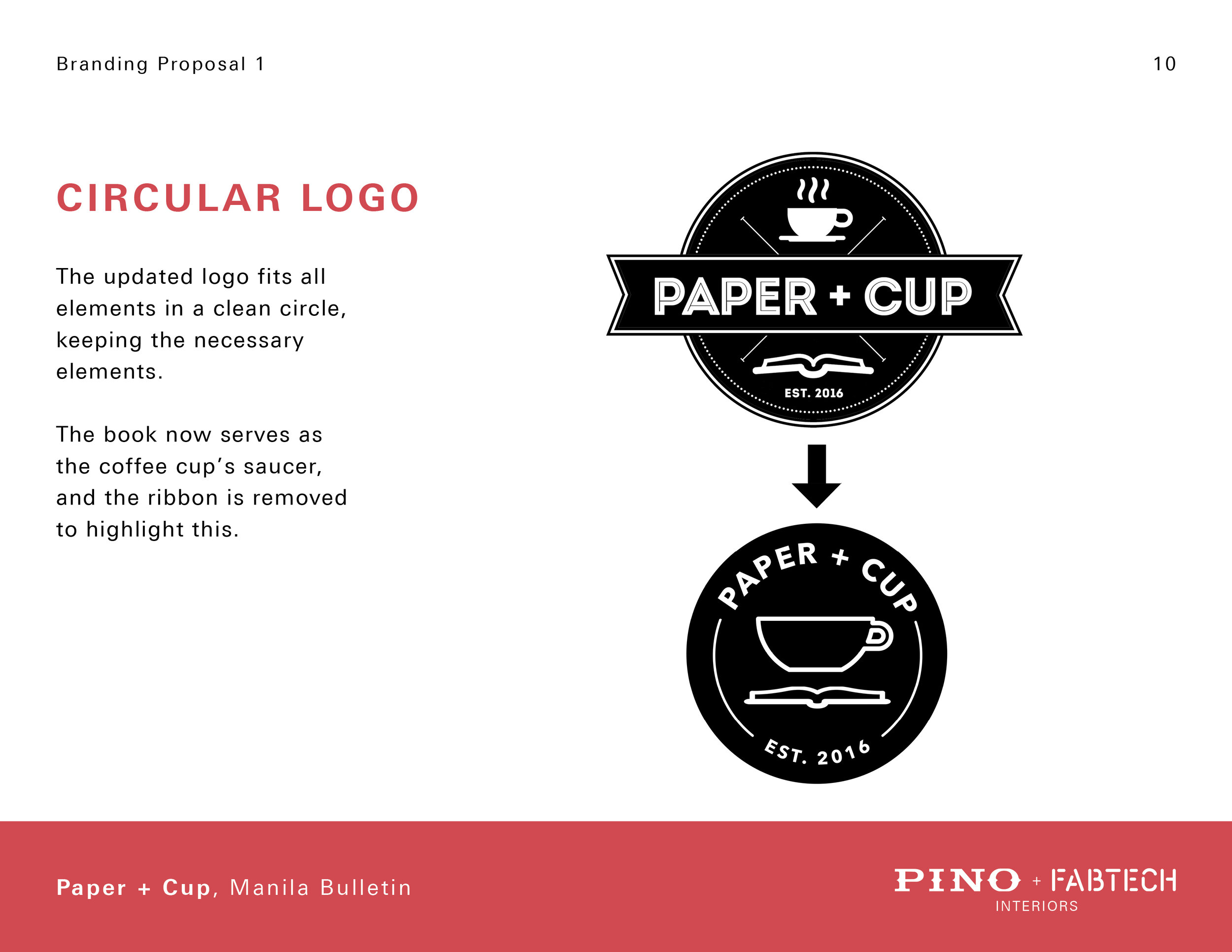
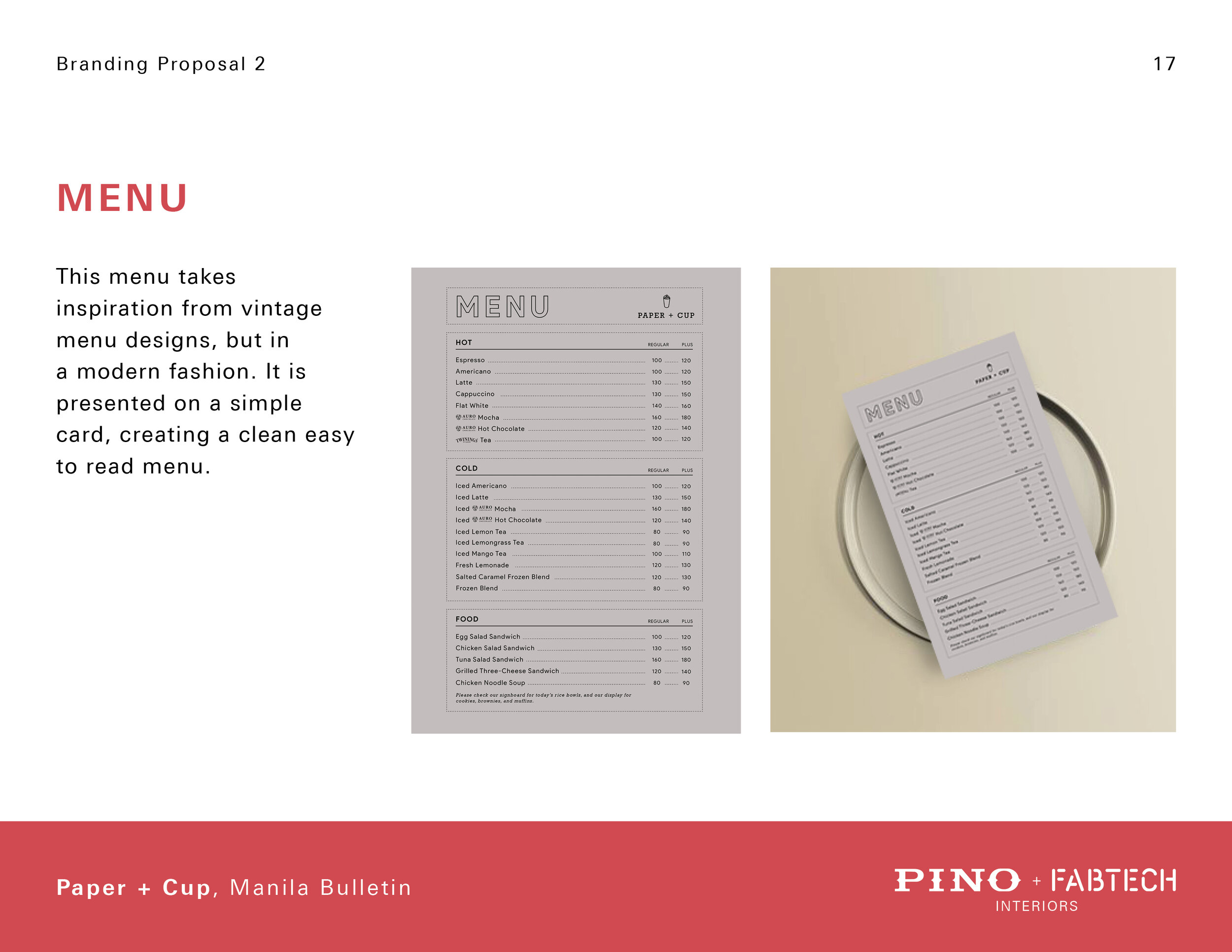
This concept updates the current Paper + Cup logo for a more modern audience. The main elements are kept and presented in a simplified manner. The cup and book are combined, making a stronger singular visual, while the text is placed around the logo for a friendlier appeal. updated logo fits all elements in a clean circle, keeping the necessary elements. The book now serves as the coffee cup’s saucer, and the ribbon is removed to highlight this.

Harmony.
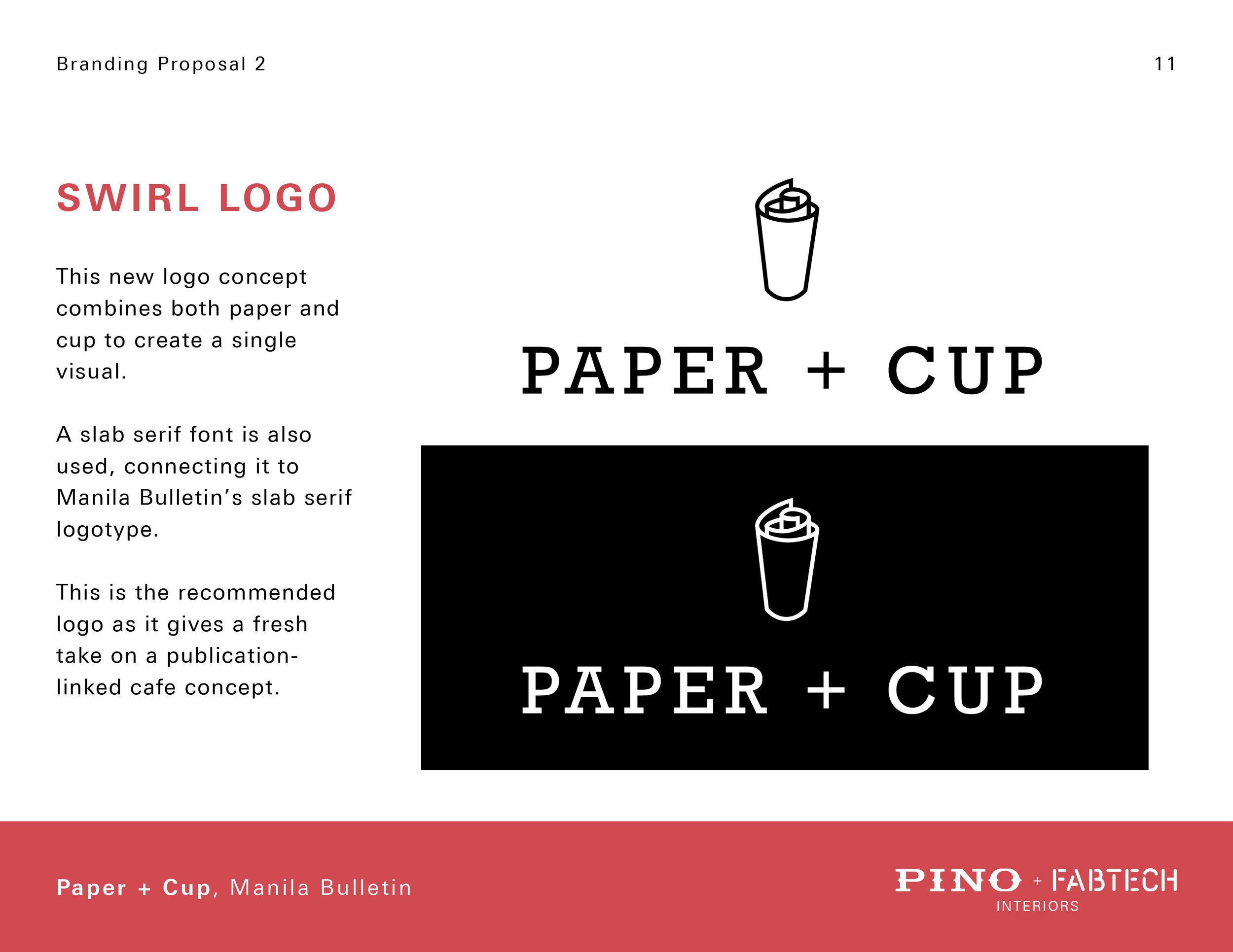
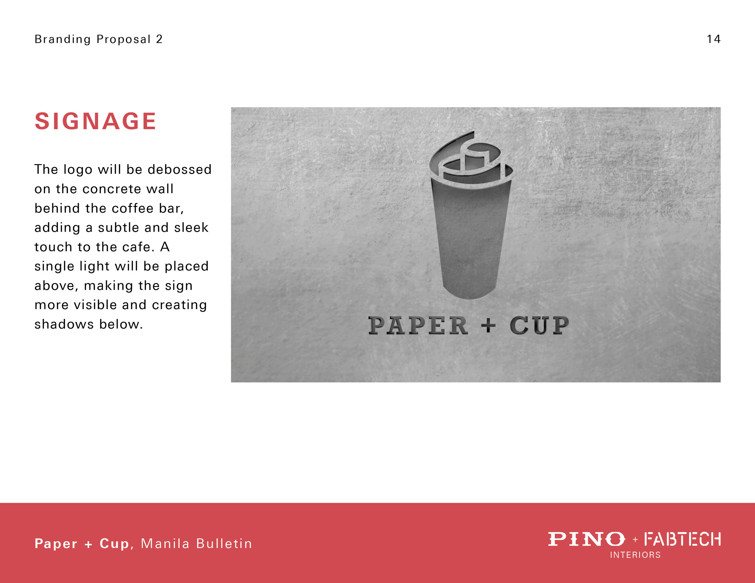
This new logo concept combines both paper and cup to create a single visual. A slab serif font is also used, connecting it to Manila Bulletin’s slab serif logotype. This is the recommended logo as it gives a fresh take on a publication linked cafe concept.
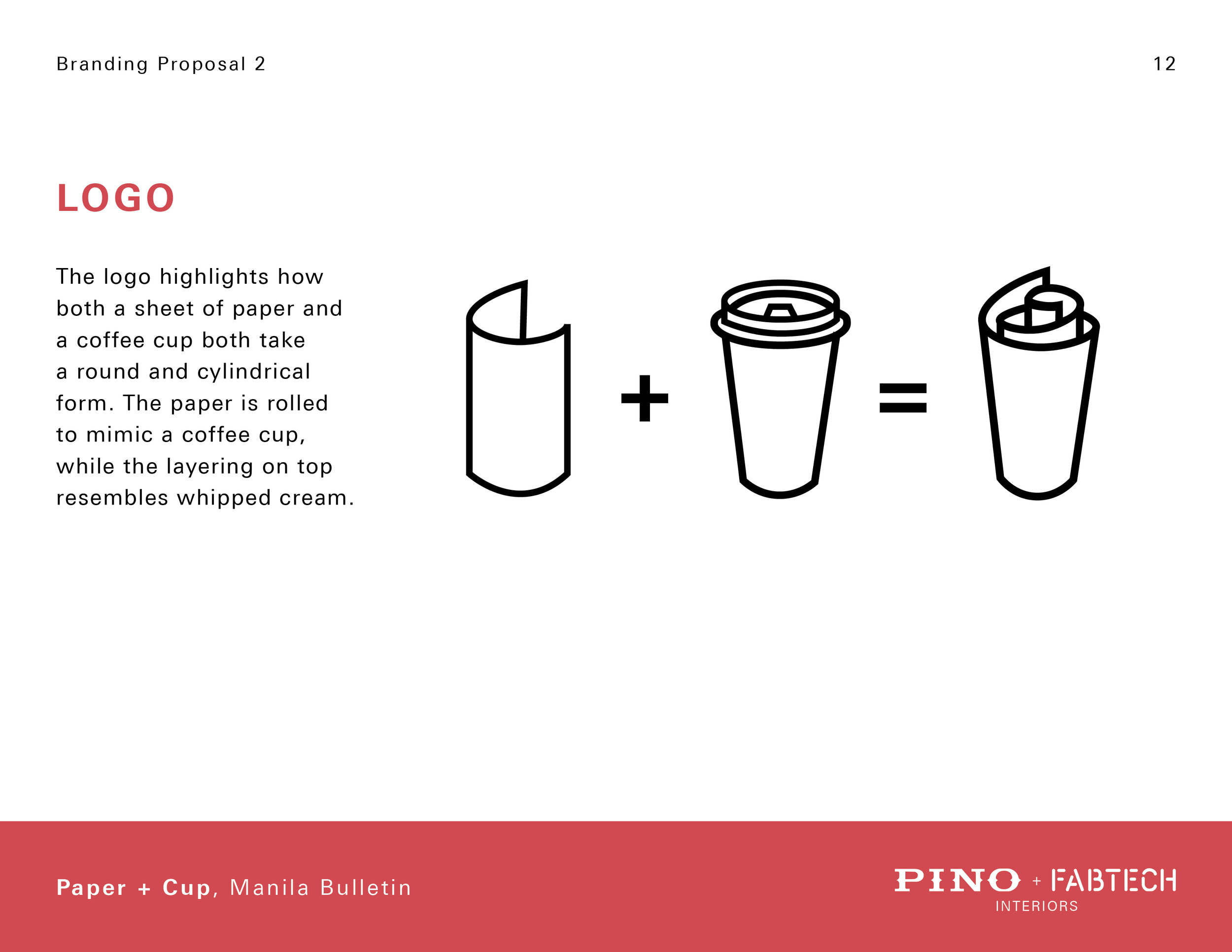
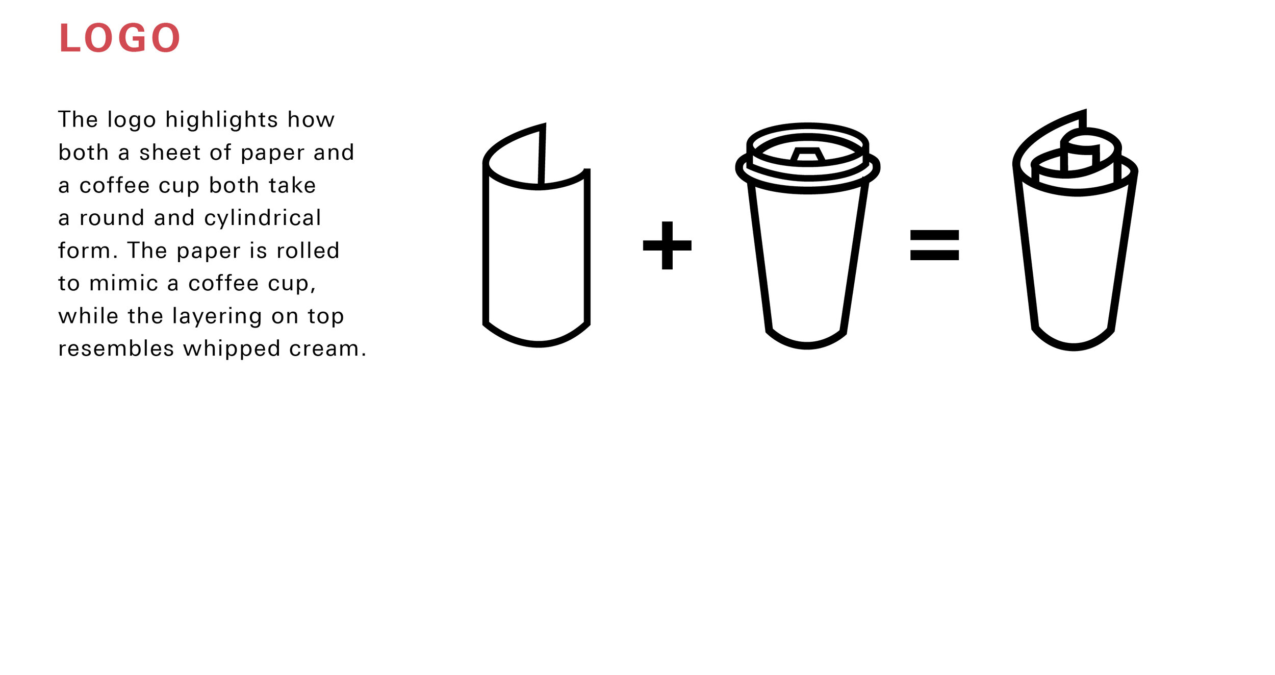
The logo highlights how both a sheet of paper and a coffee cup both take a round and cylindrical form. The paper is rolled to mimic a coffee cup, while the layering on top resembles whipped cream.

INTERIOR DESIGN PROPOSAL
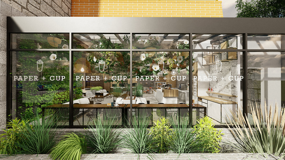
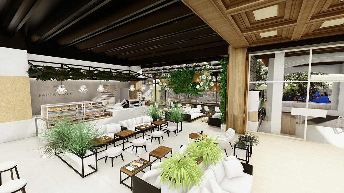
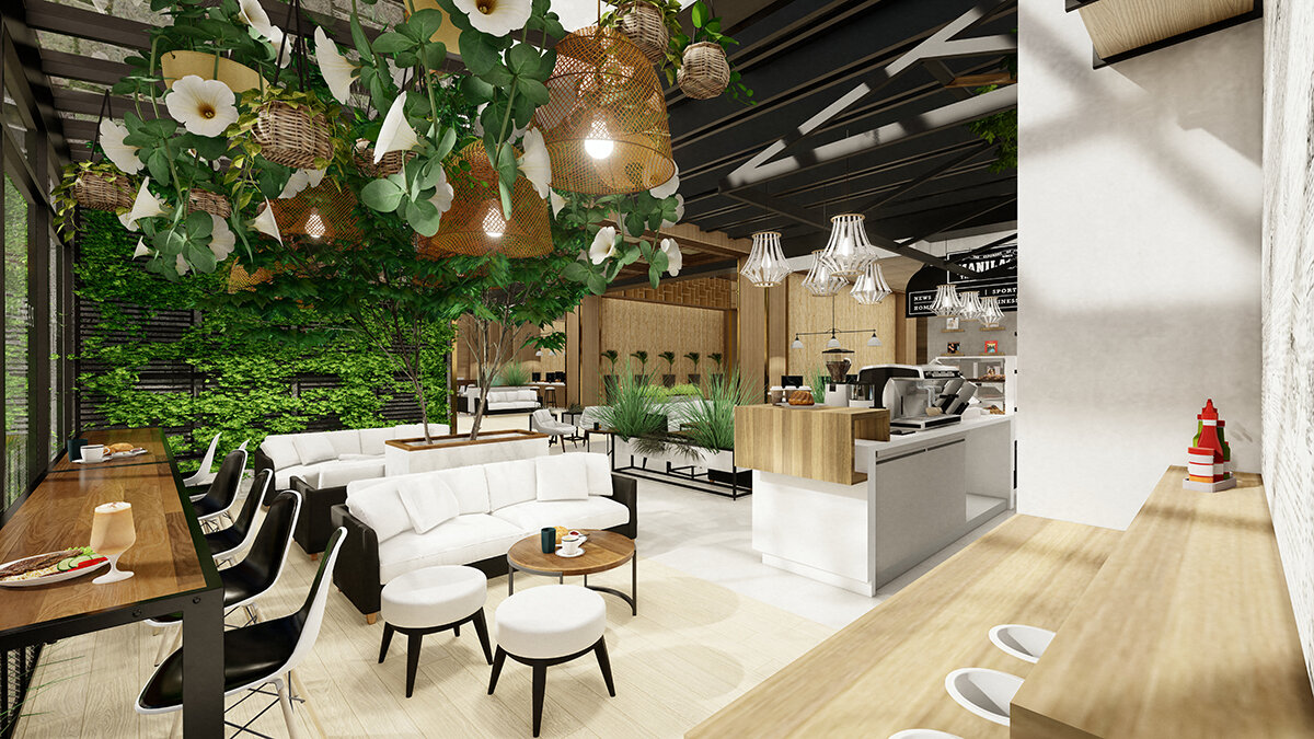
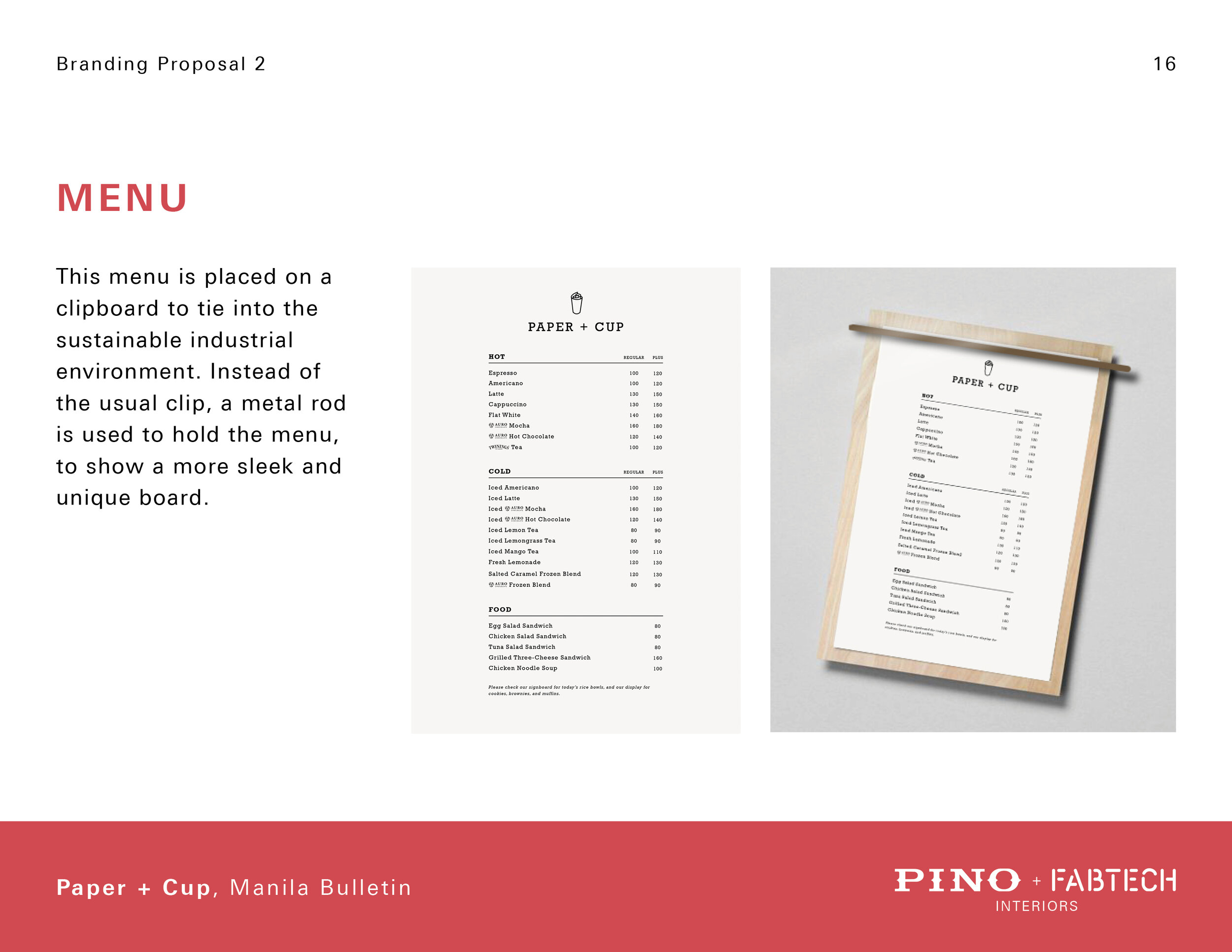
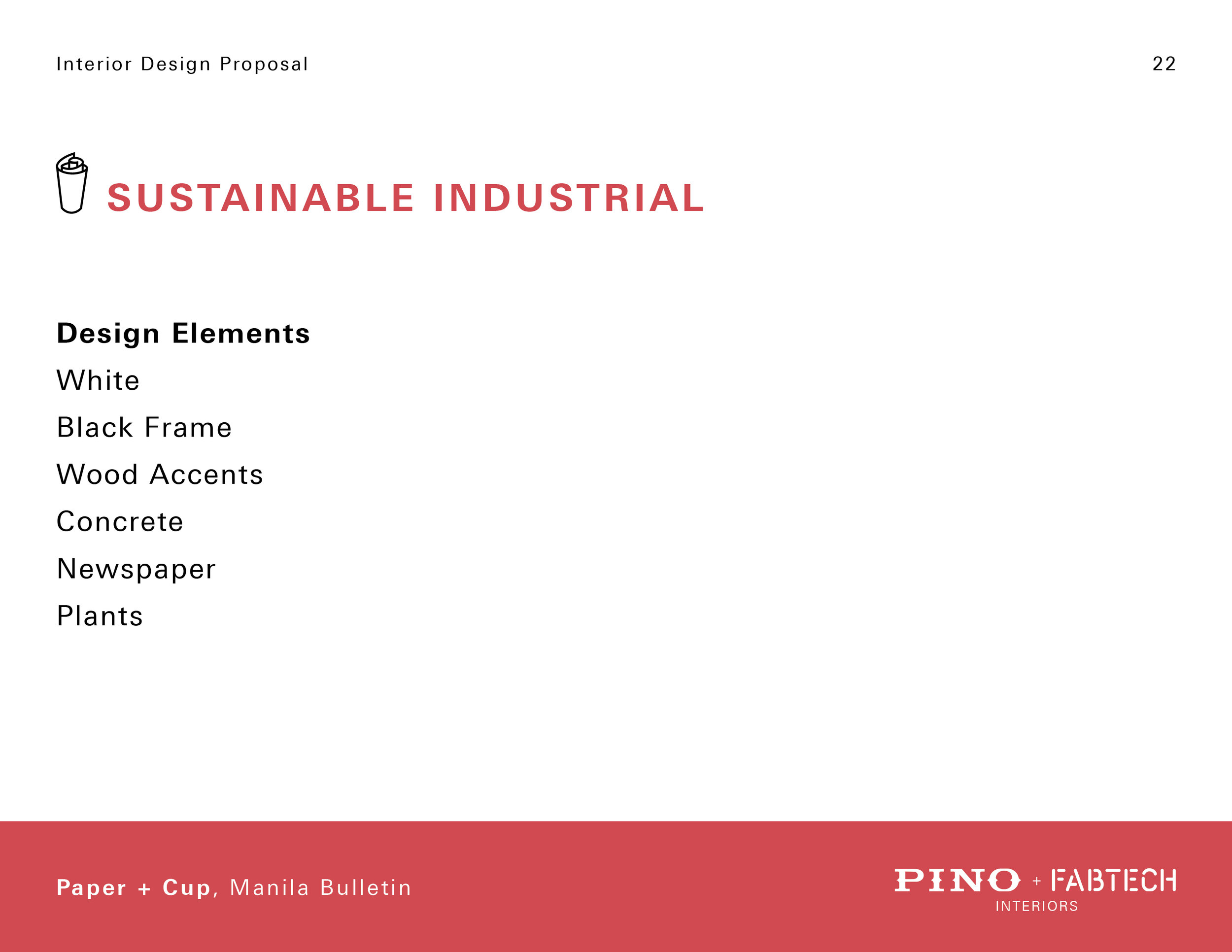
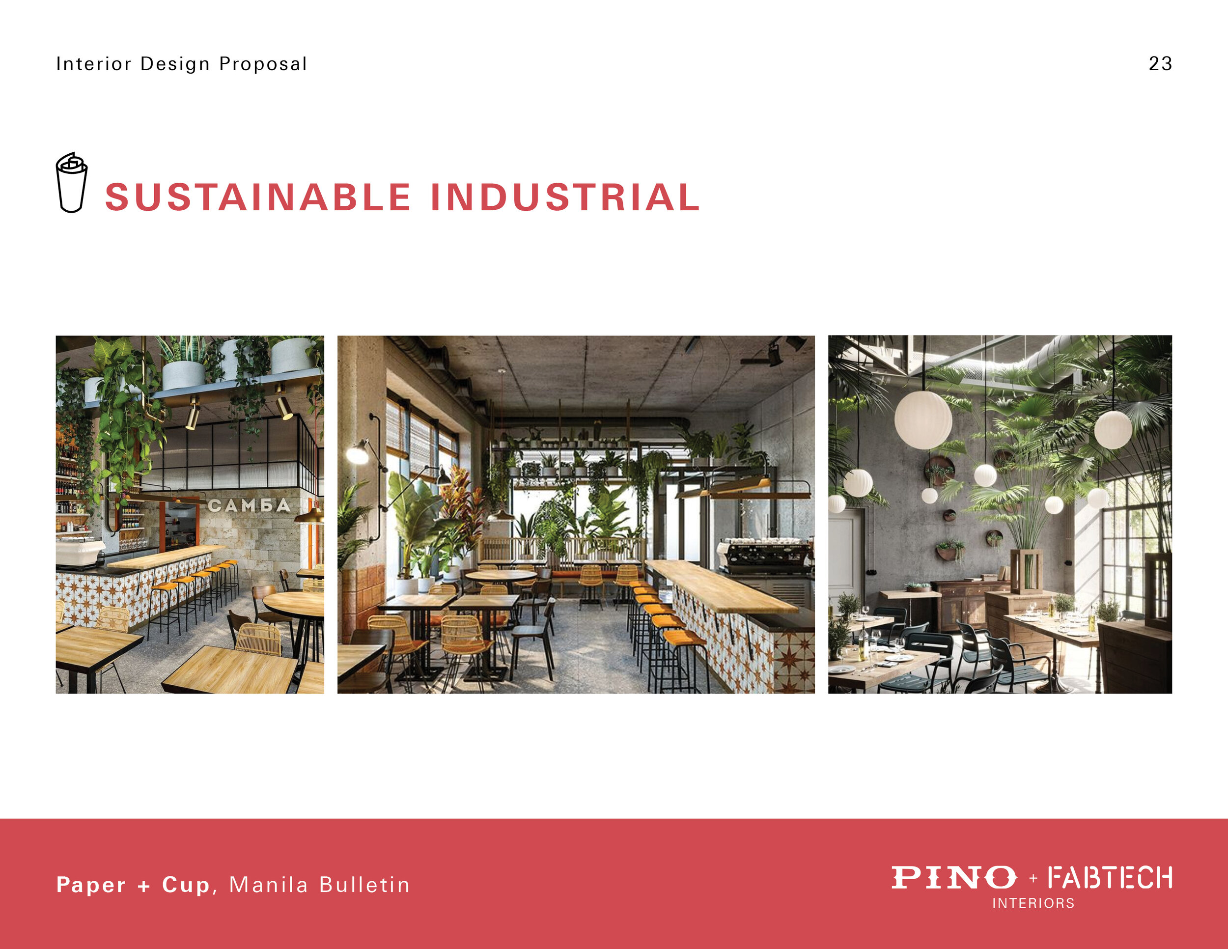
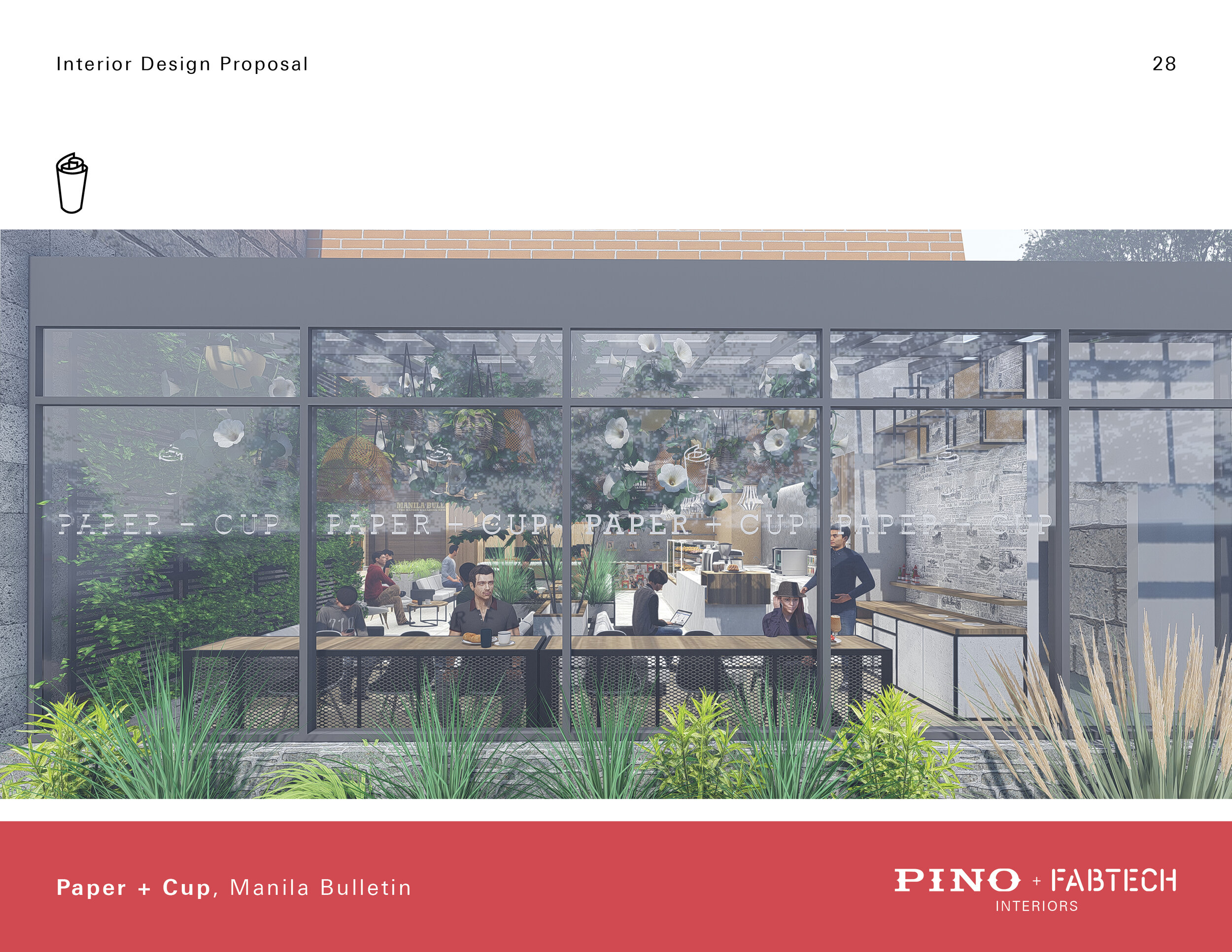
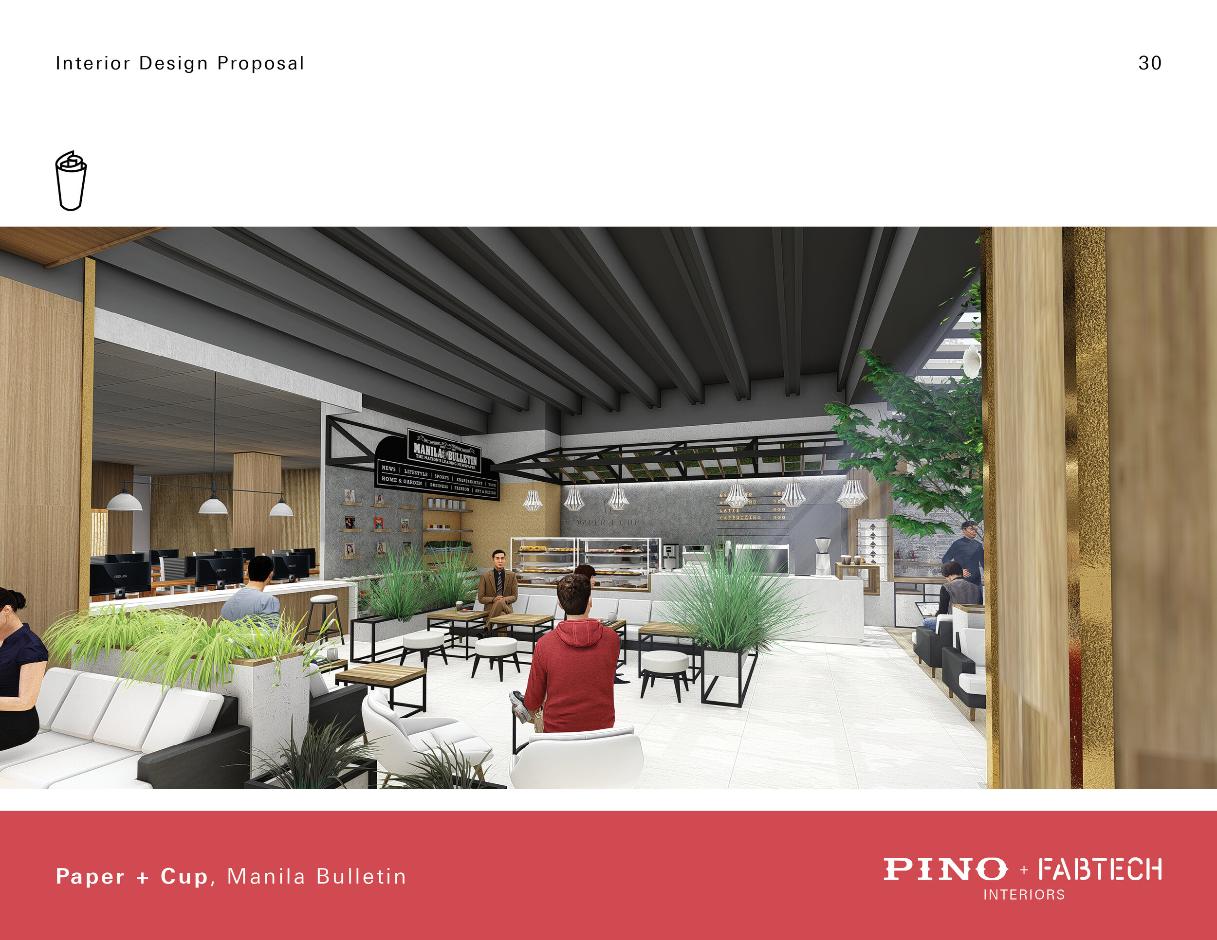
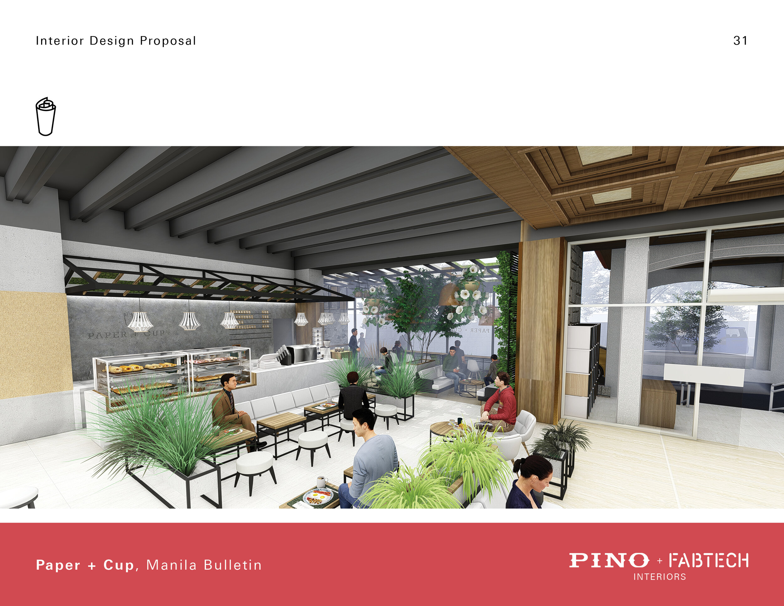
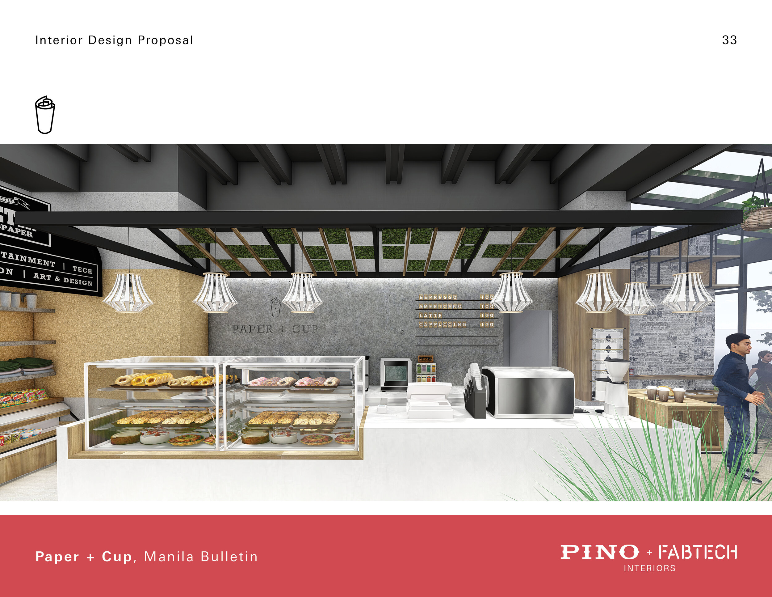
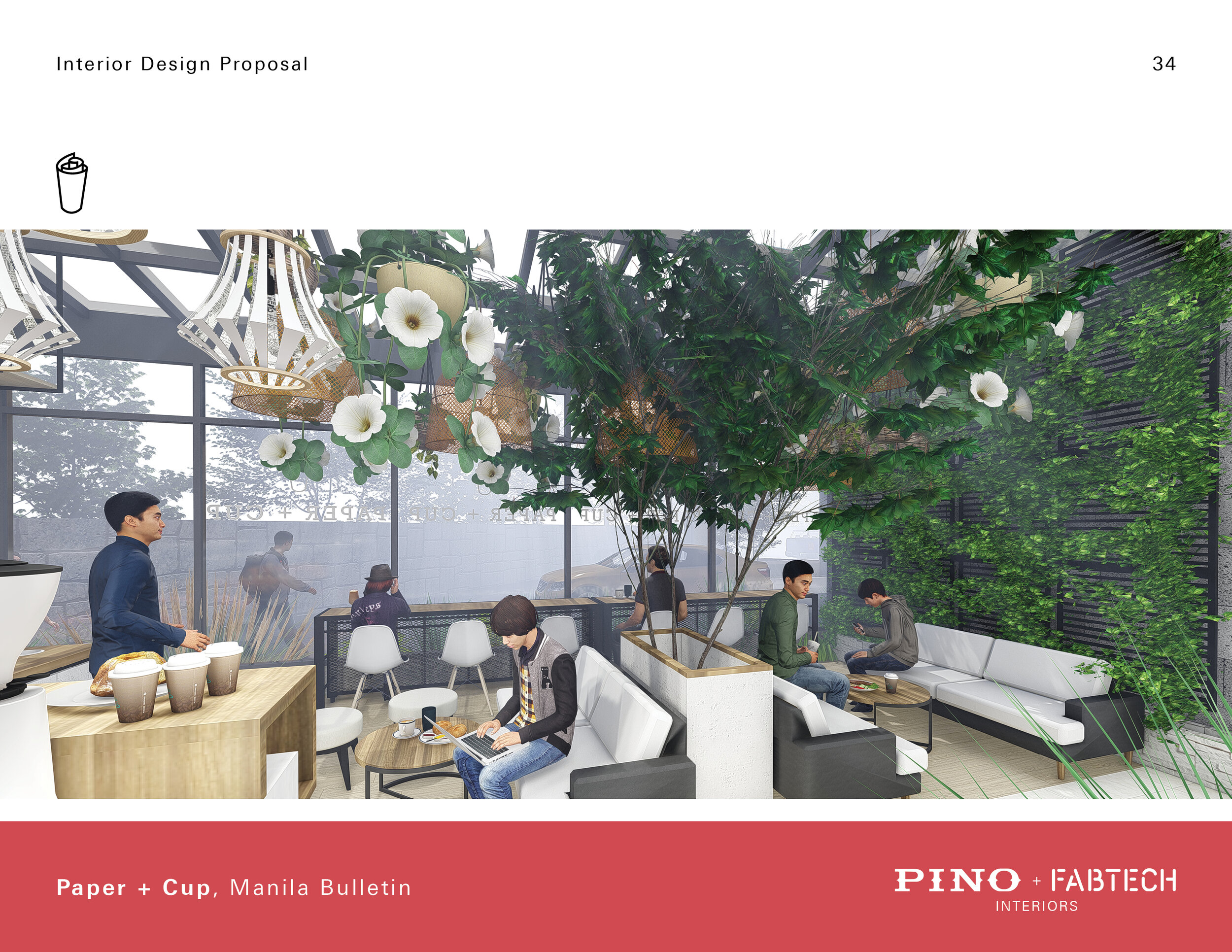
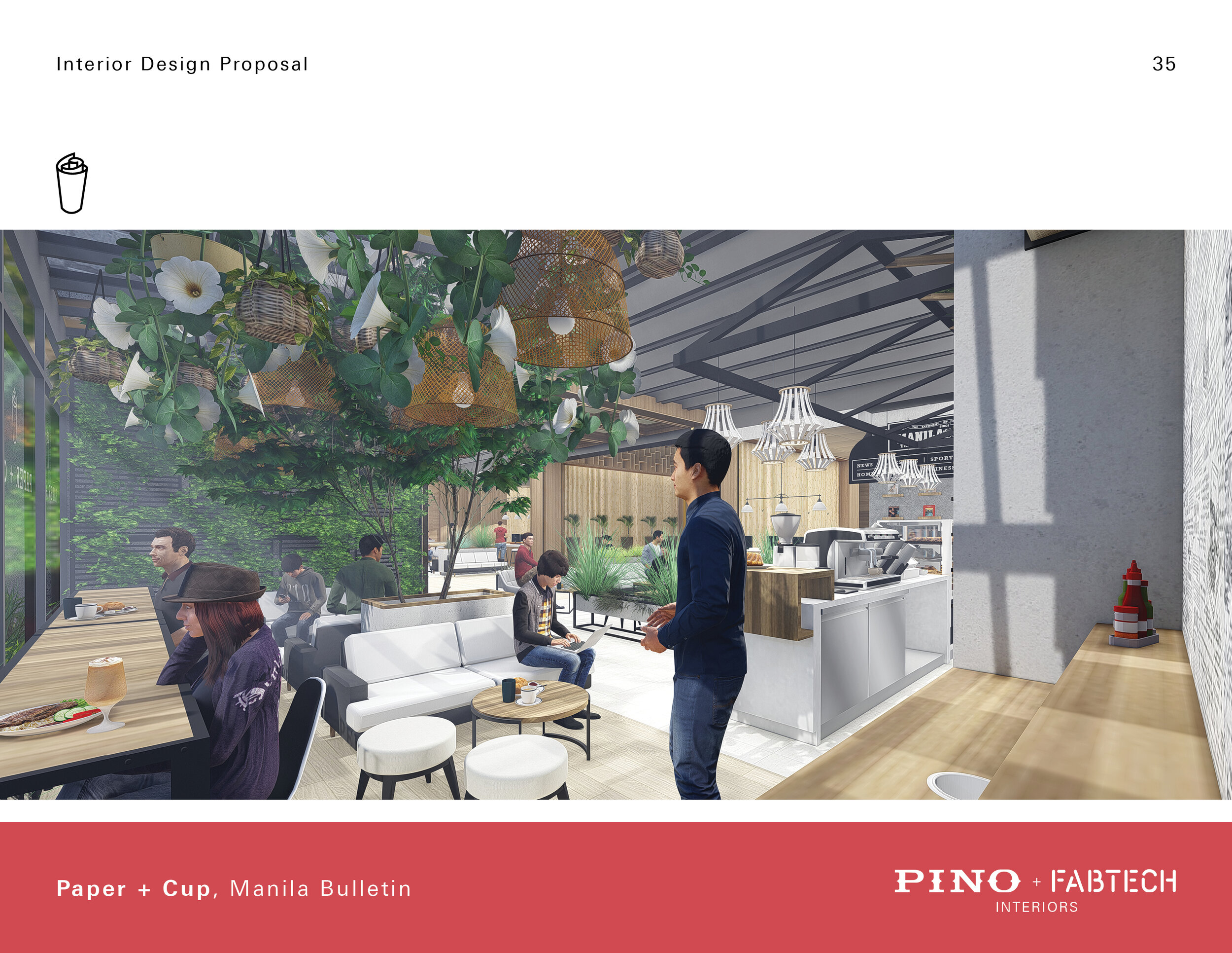
Sustainable Industrial
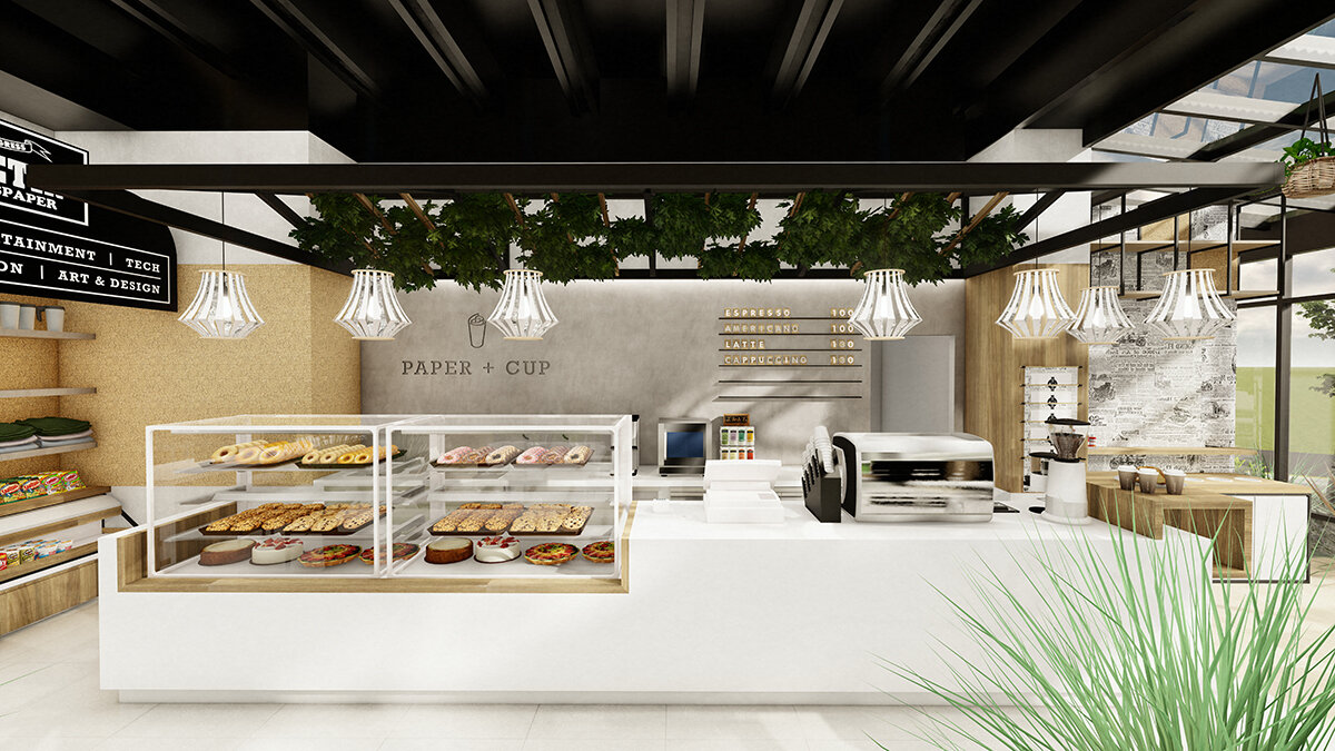
A concept that provides an updated look of not only Paper + Cup but also Manila Bulletin as a whole. It embraces the industrial nature of the printing press while bringing it to the modern sustainable era. The design also highlights the freshness of the food it serves.
Design Elements
White
Black Frame
Wood Accents
Concrete
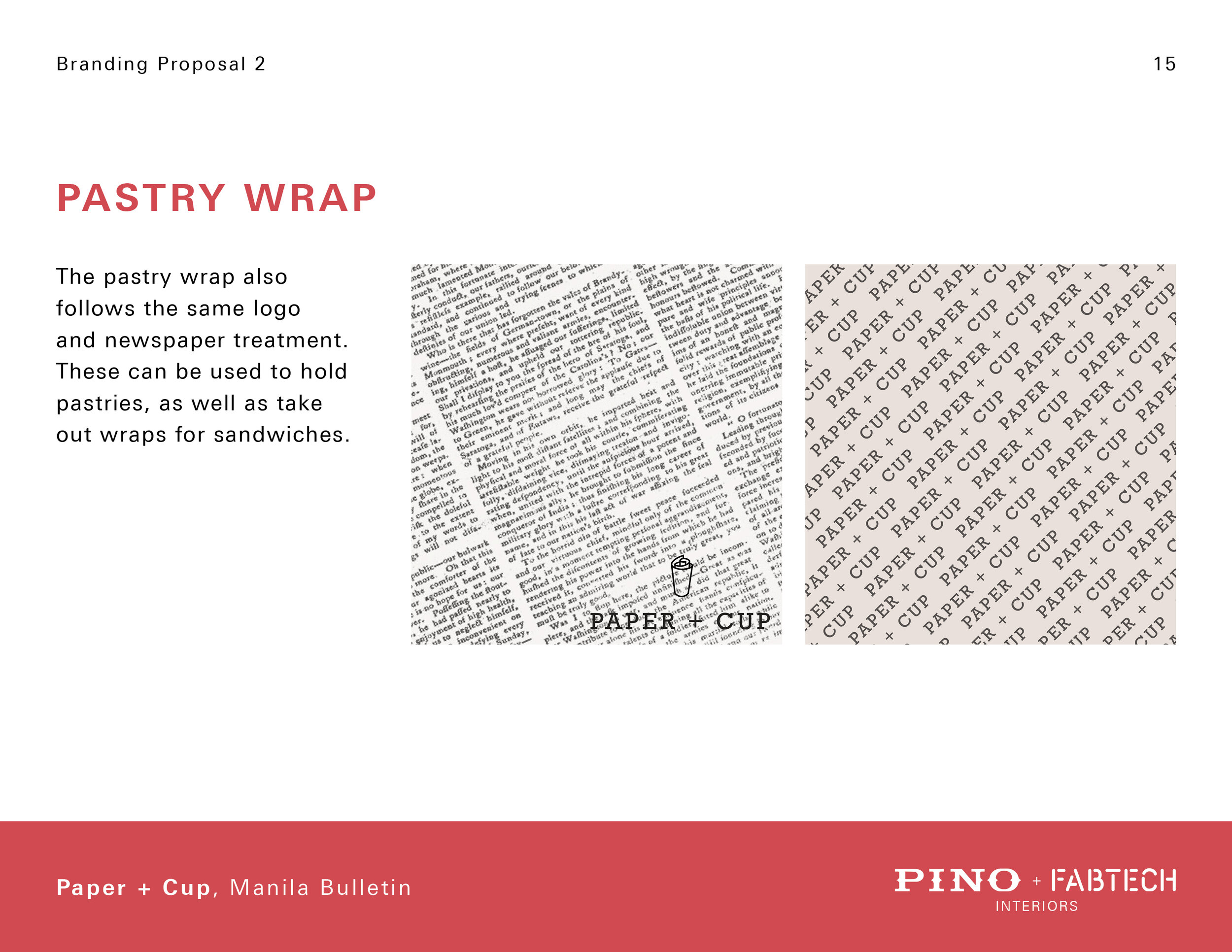
Newspaper
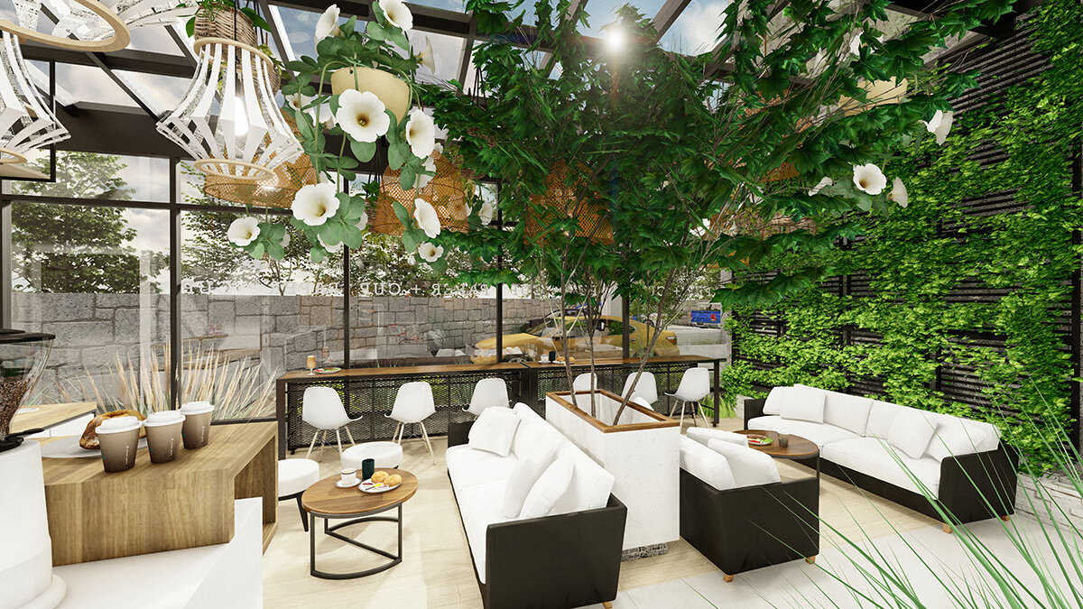
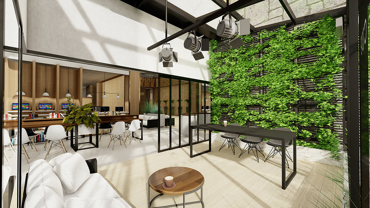
Plants
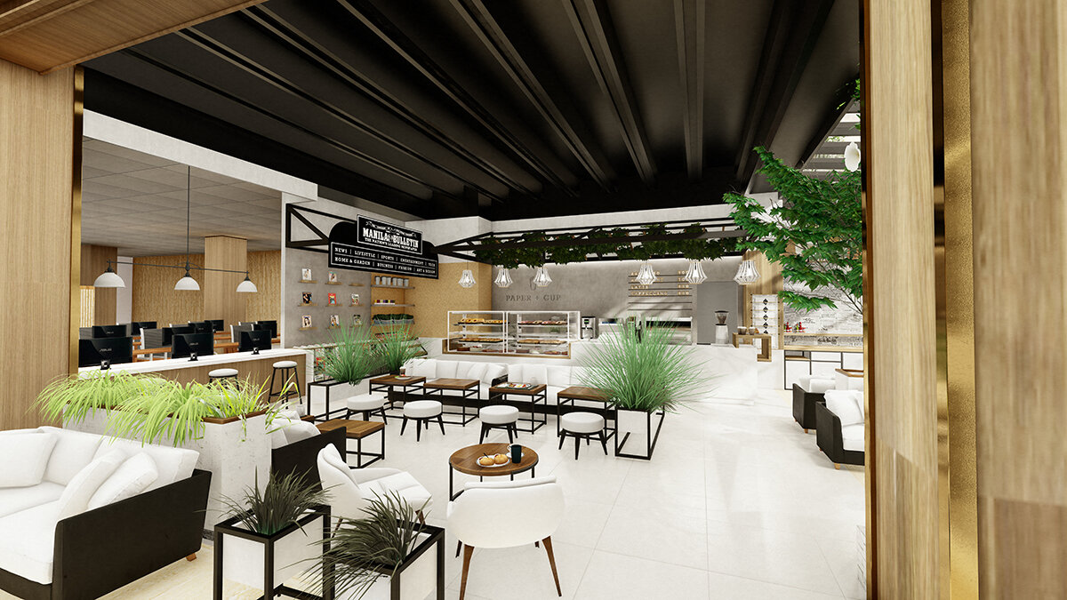
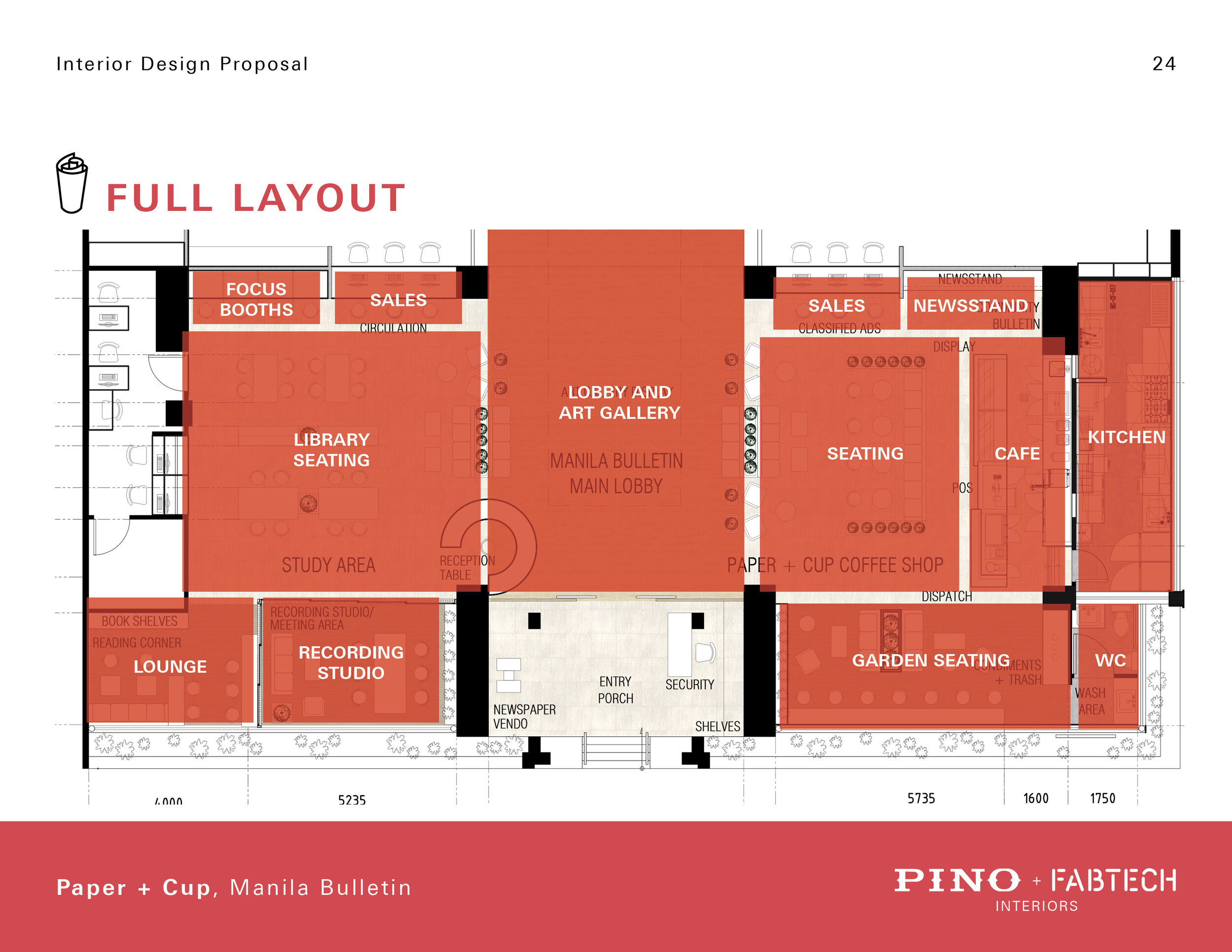
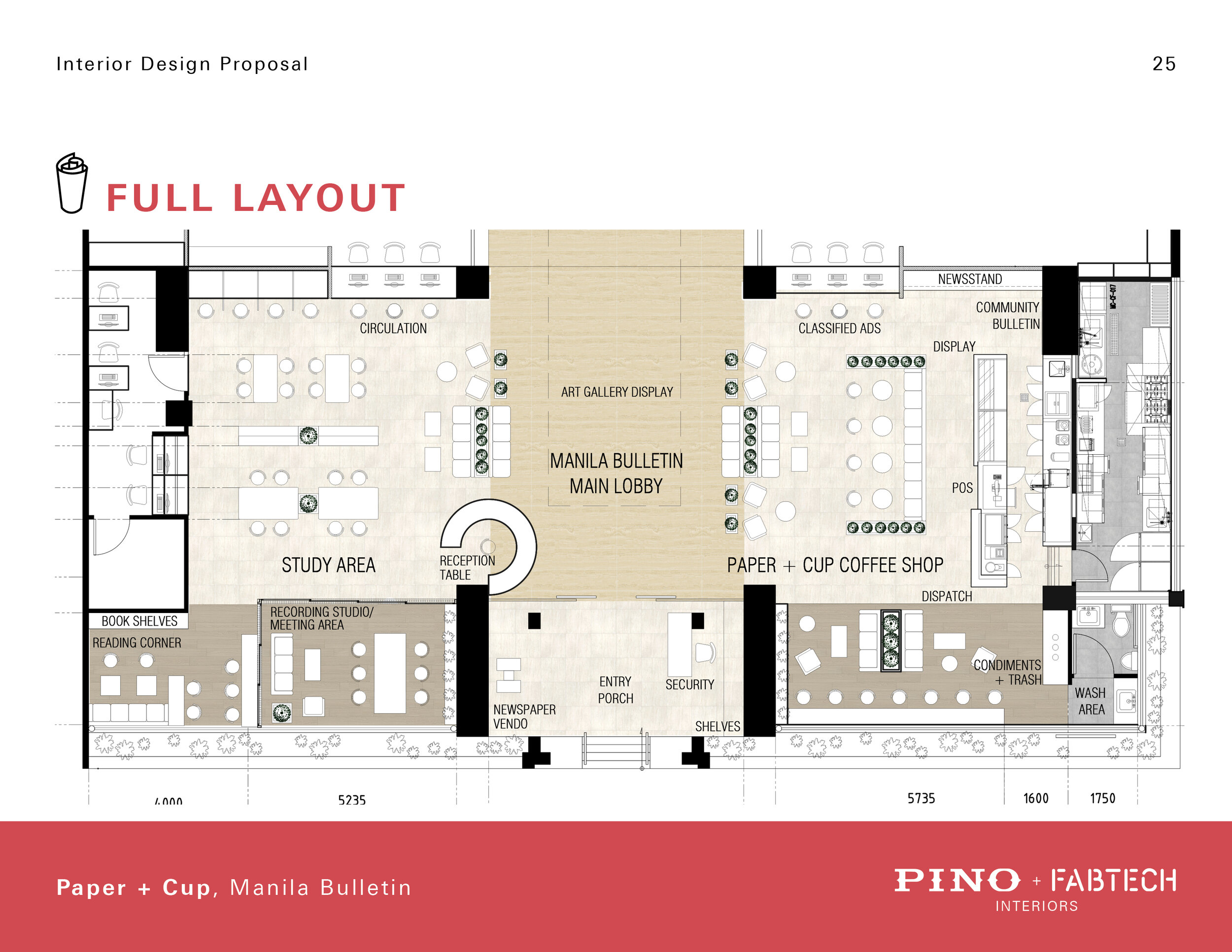
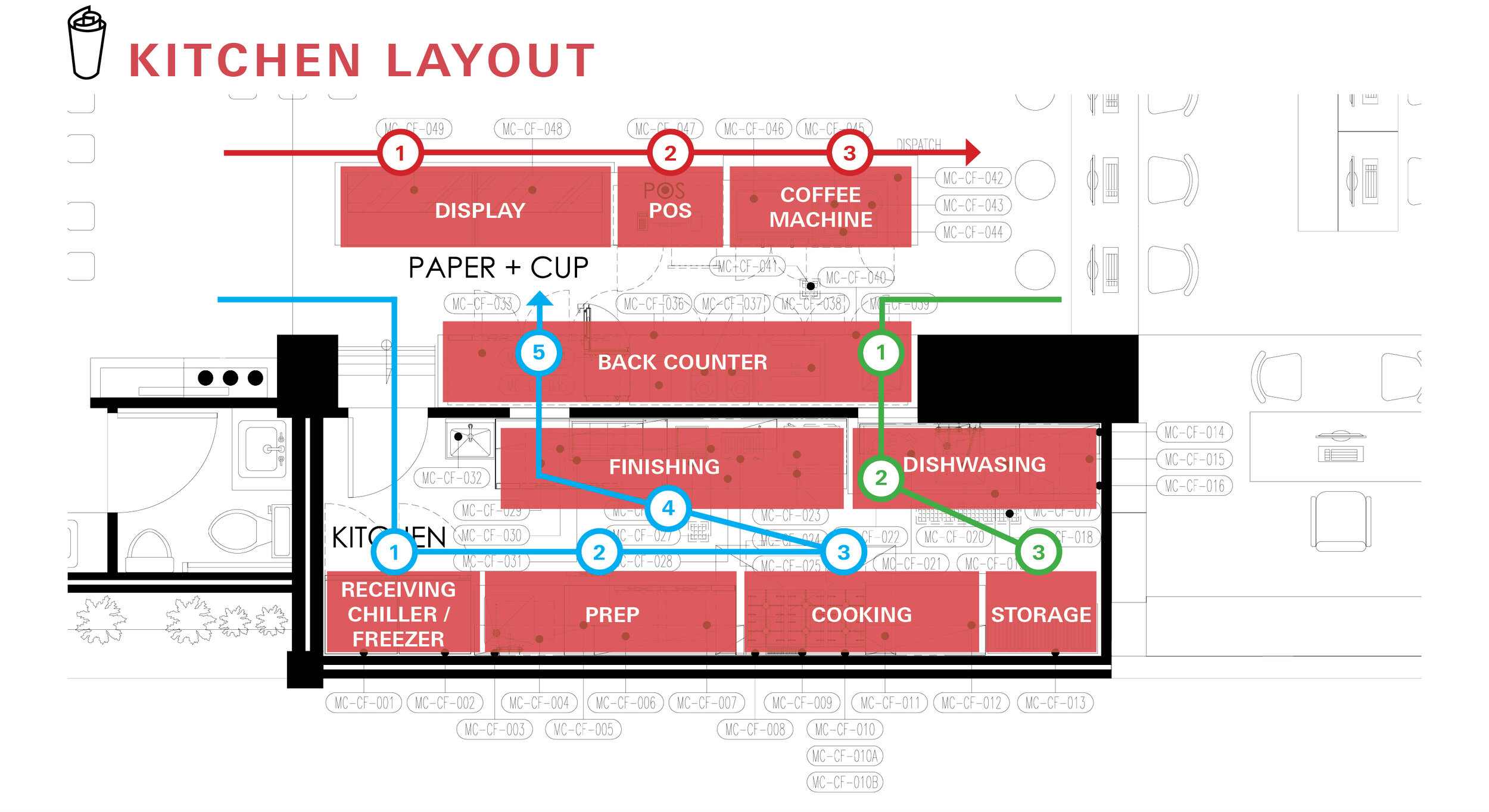
My philosophy when designing spaces is maximizing space by stacking different programs together making it very flexible. By creating different distinct spaces and allowing each to fluidly interact with one another, you can create endless configurations that allow the users to be more creative.
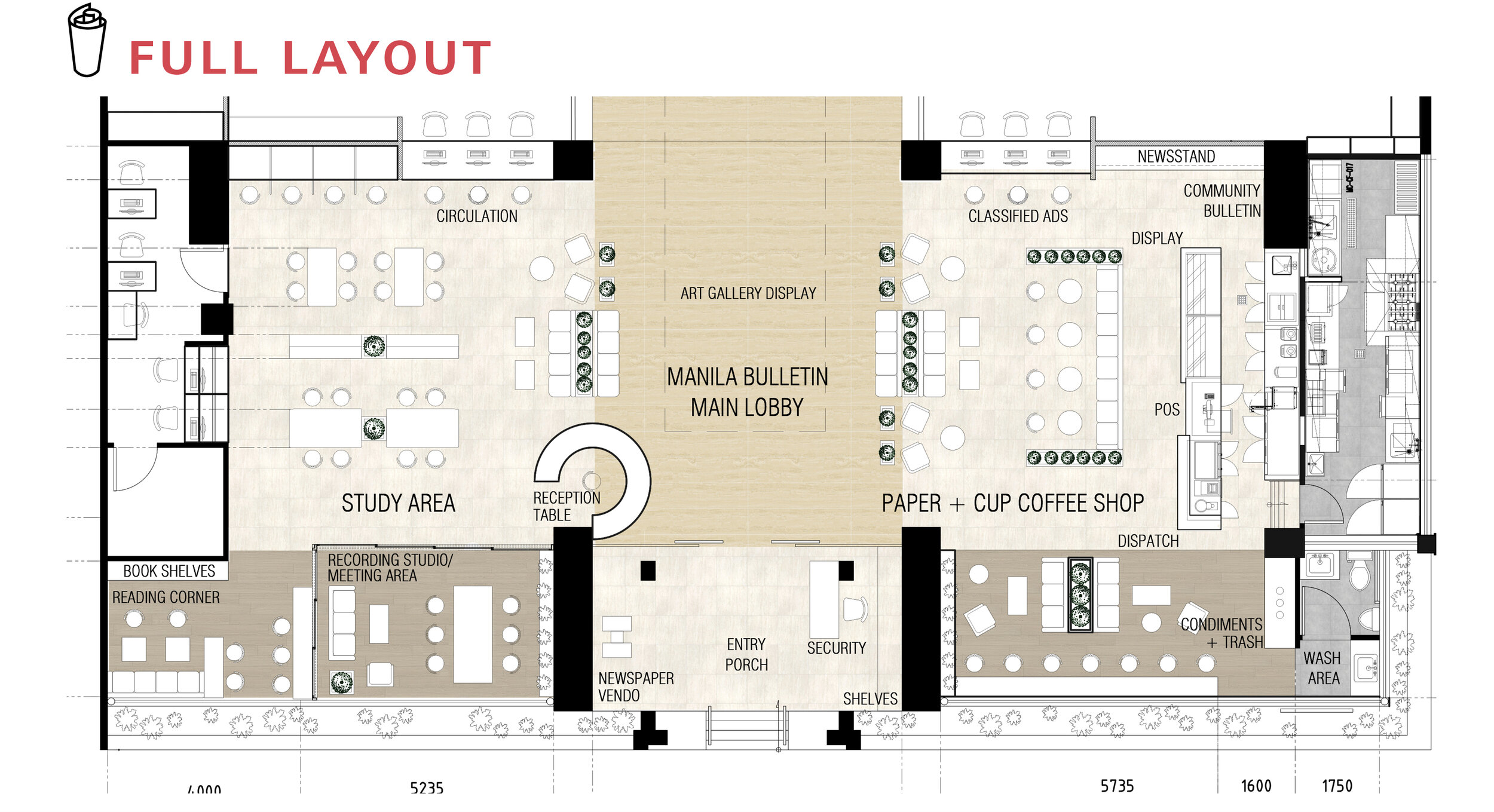
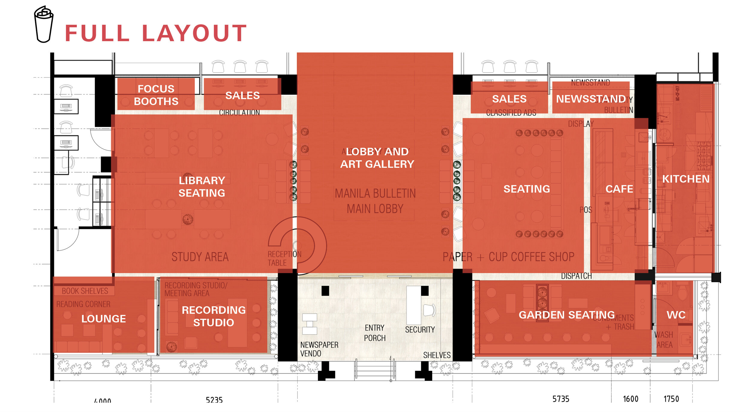
Programs
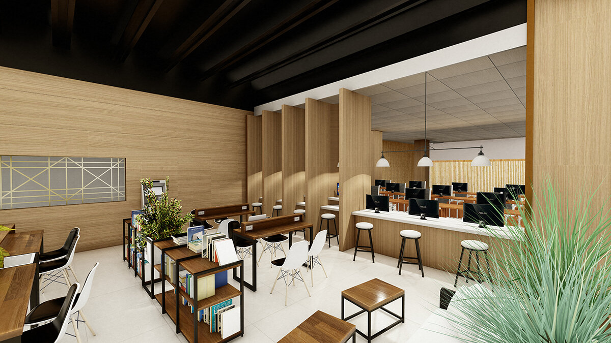
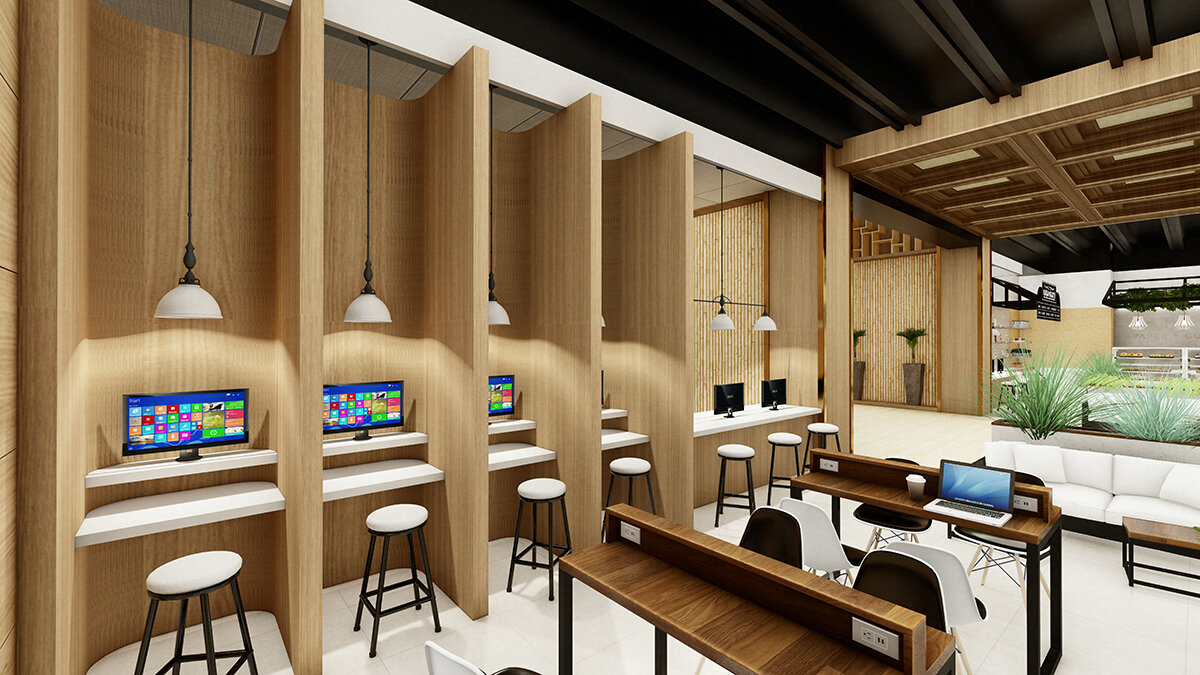
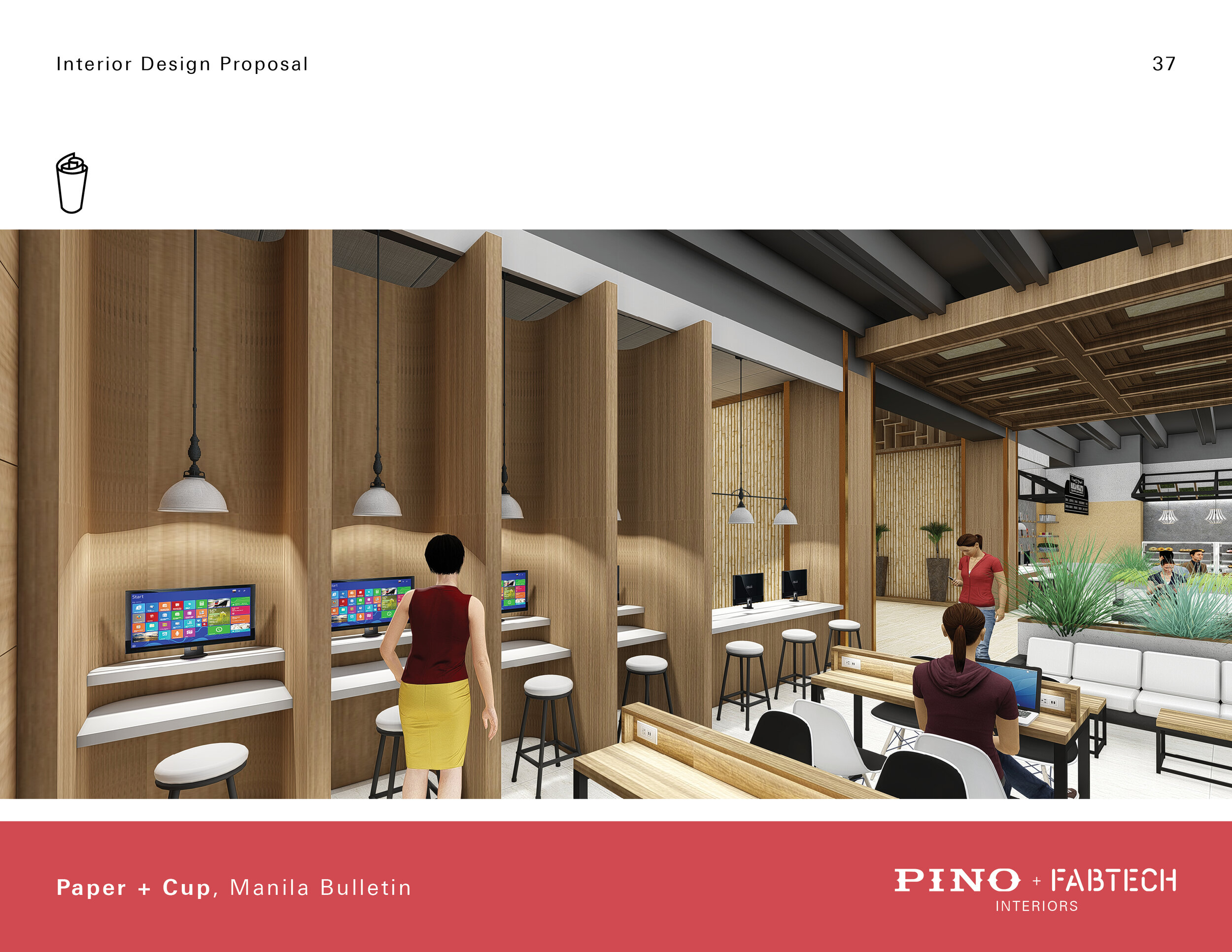
Focus Booth
Manila Bulletin is undergoing digitalization of its archive. Students will be able to access these archives through access points in the focus booths. This also creates a more private space for students to really focus in on their work.
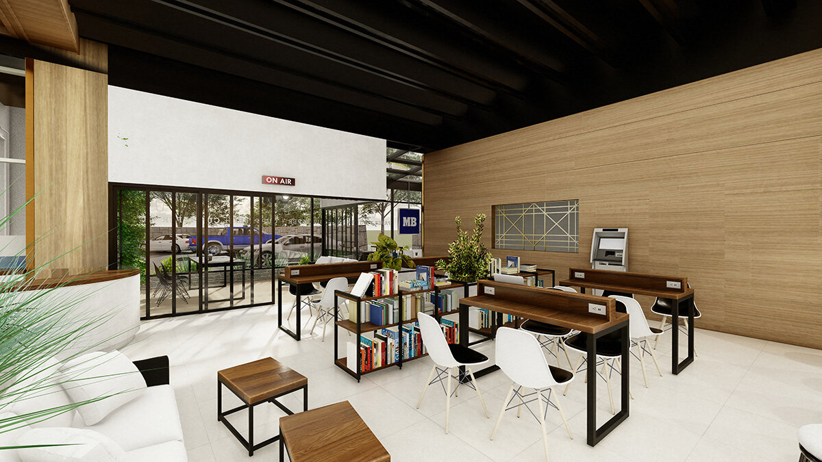
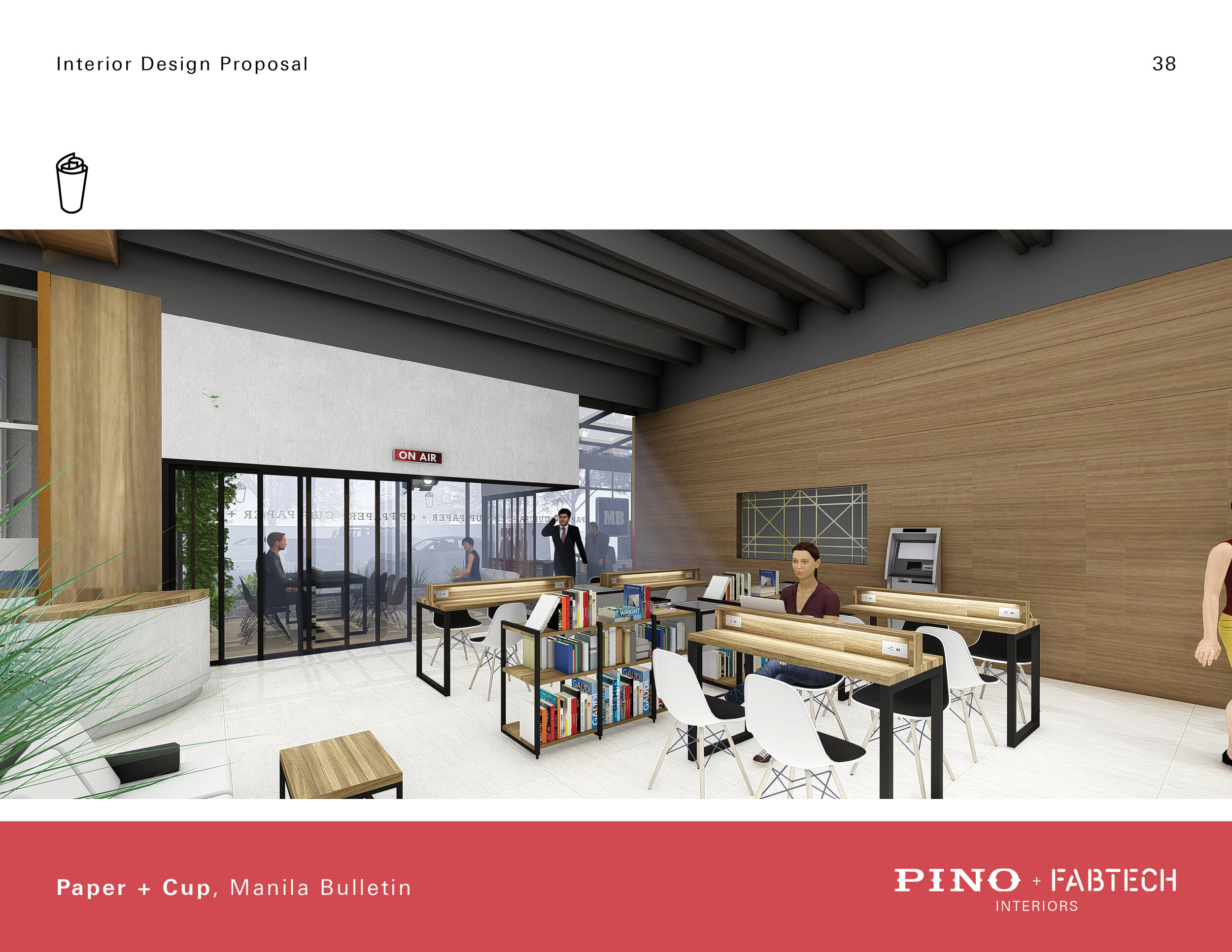
Library / Research Center
Library tables equipped with lights and electrical outlets provide students with a space to do their research. Plants scattered around the area will provide them a soothing atmosphere.
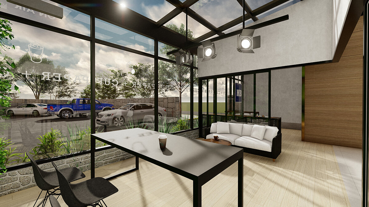
Media Lounge
The media lounge is a place where Manila Bulletin clients can view Manila Bulletin produced content. This TV can also be viewed by the glass façade of the office.
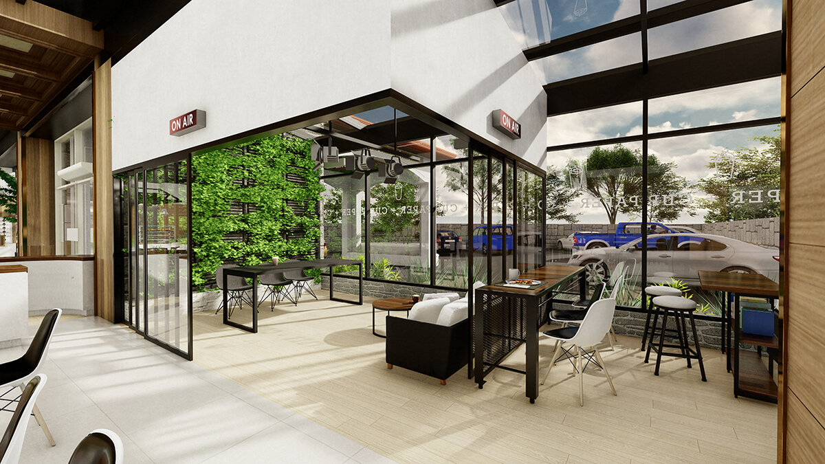
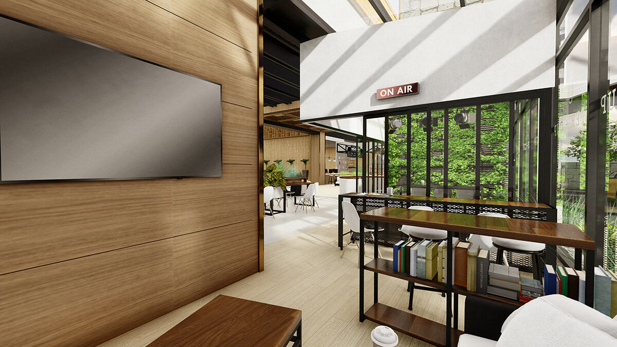
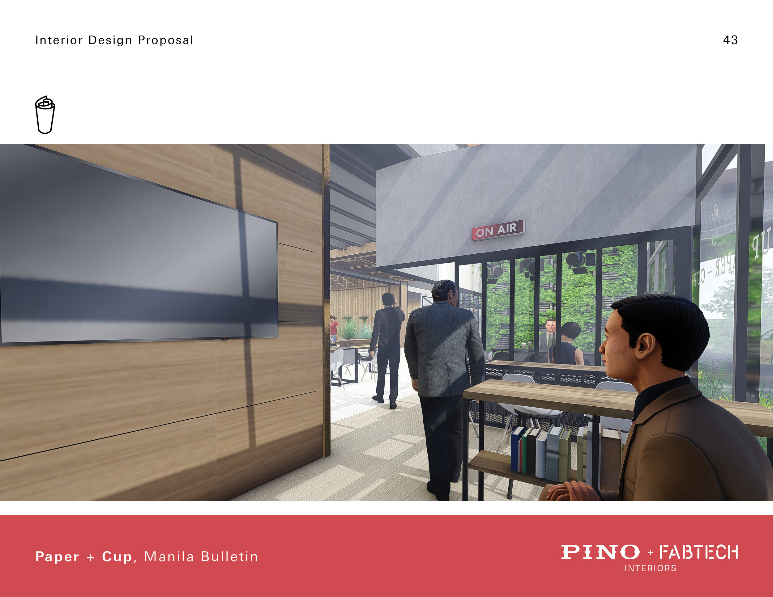
Recording Studio
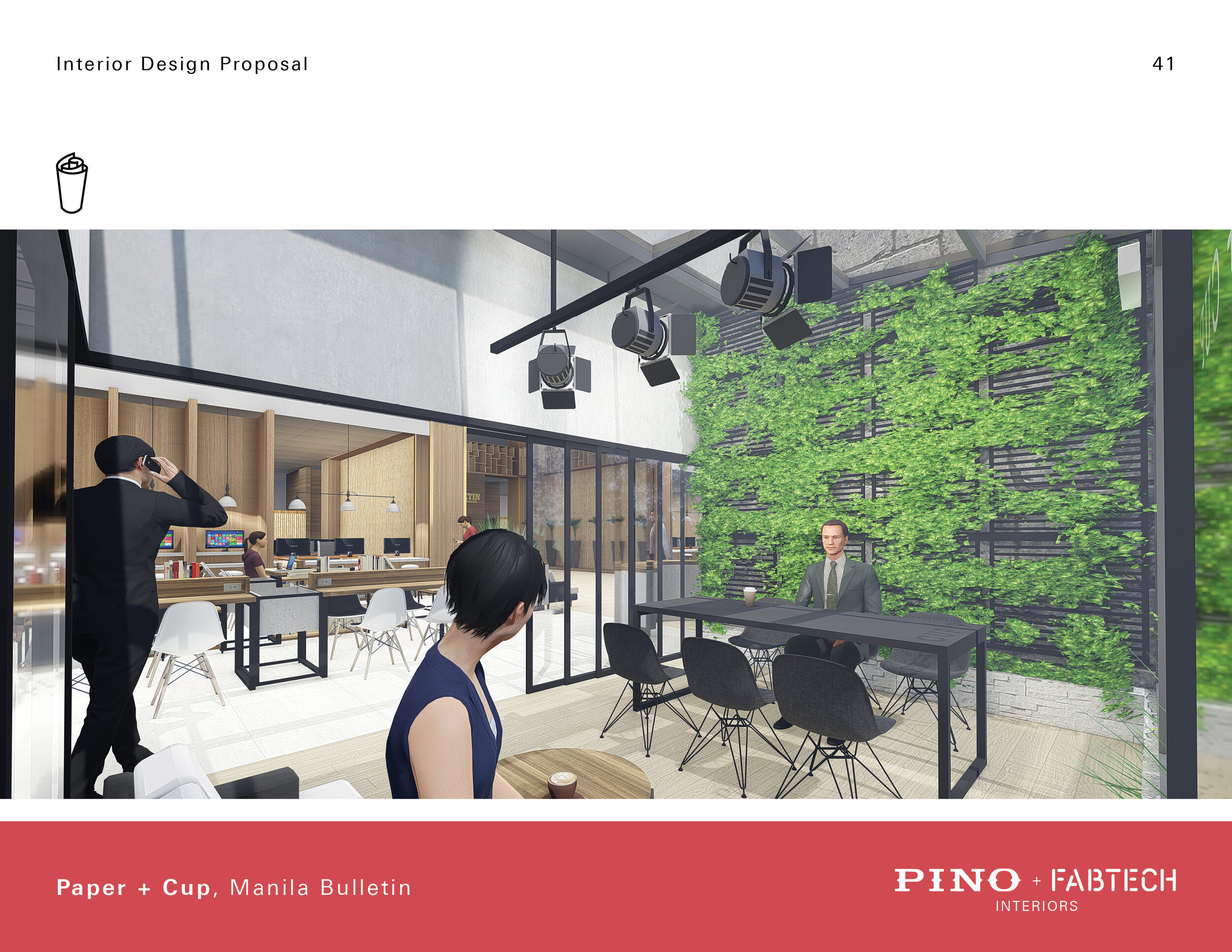
The recording studio is a multi-purpose space that can also turn into a conference room and an additional lounge. Once the sliding doors are closed, signages with the writings "ON AIR" will turn on signaling to everyone to stay quiet. The green wall backdrop with the signage of MB acts as a signature background for all MB related media content.
Lobby and Art Gallery
This space will be used to showcase many of MB's activities with the local art scene.
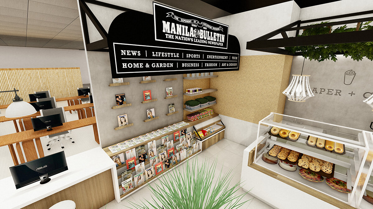
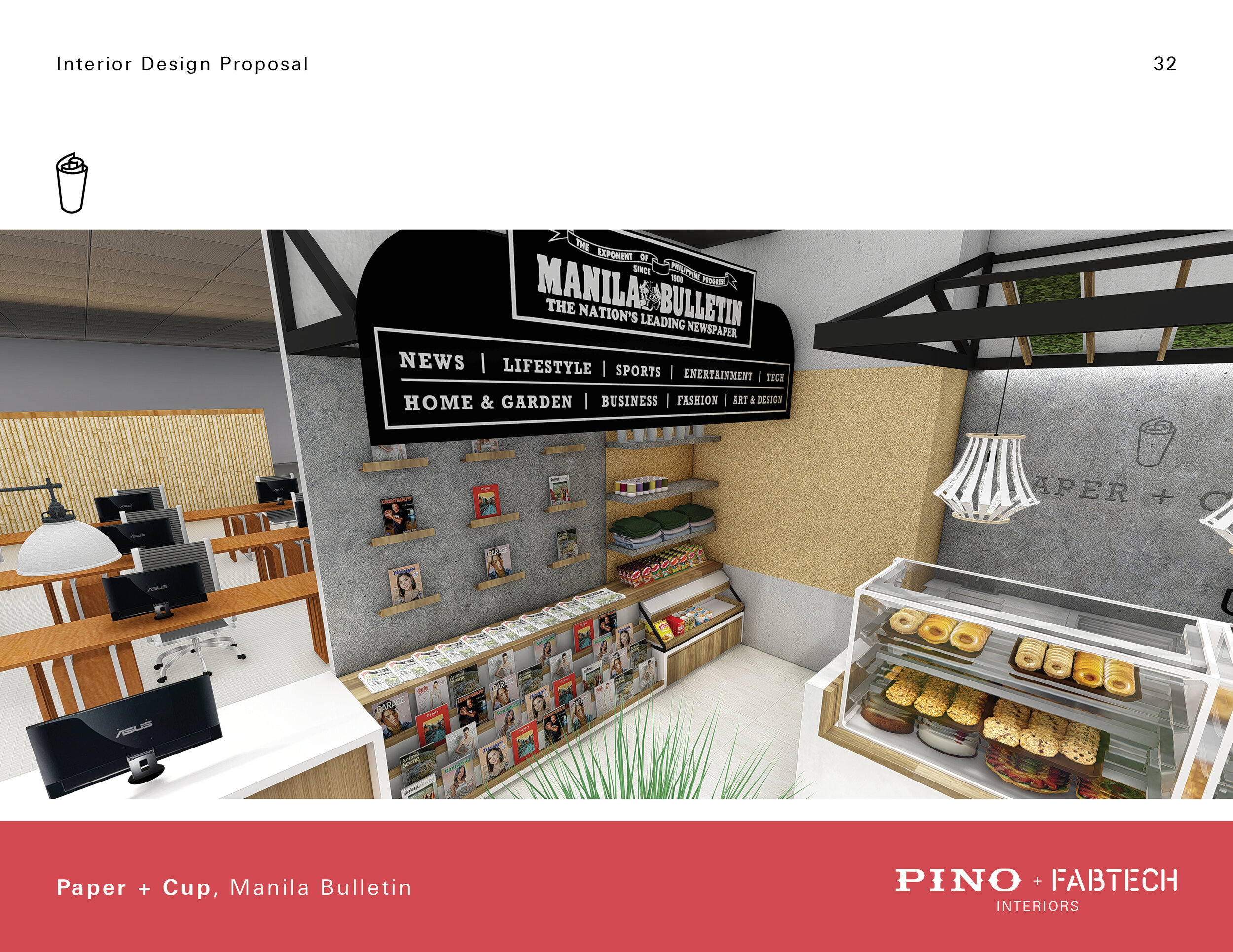
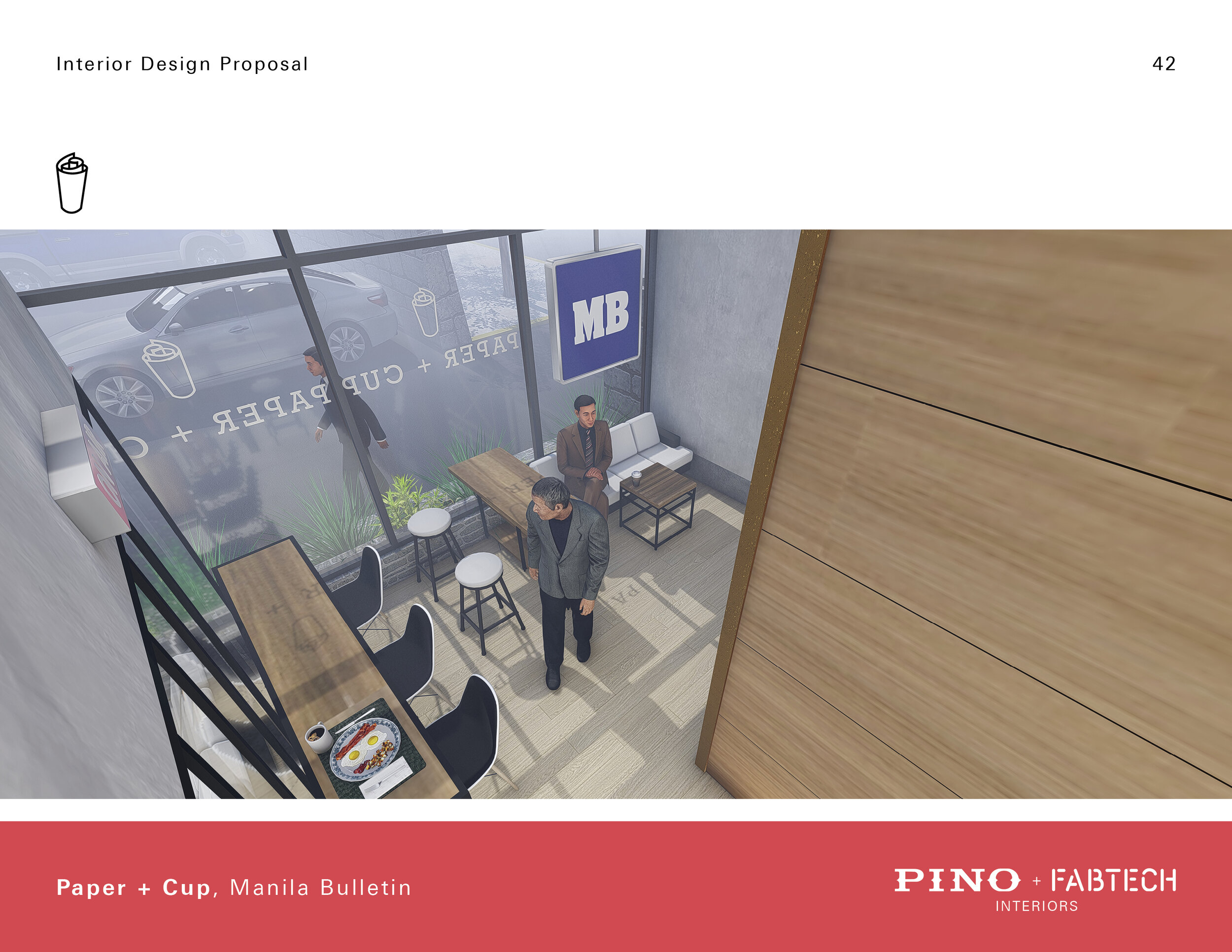
Newsstand
Previously, MB did not have a space to showcase their products such as the newspaper and its many magazines. The newsstand will act as a showcase for all these products. It is also a place where they can sell small items such as candy and snacks. This is very reminiscent of newsstands in New York City.
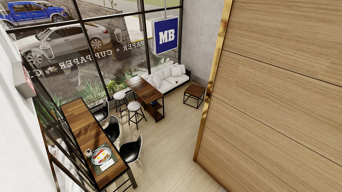
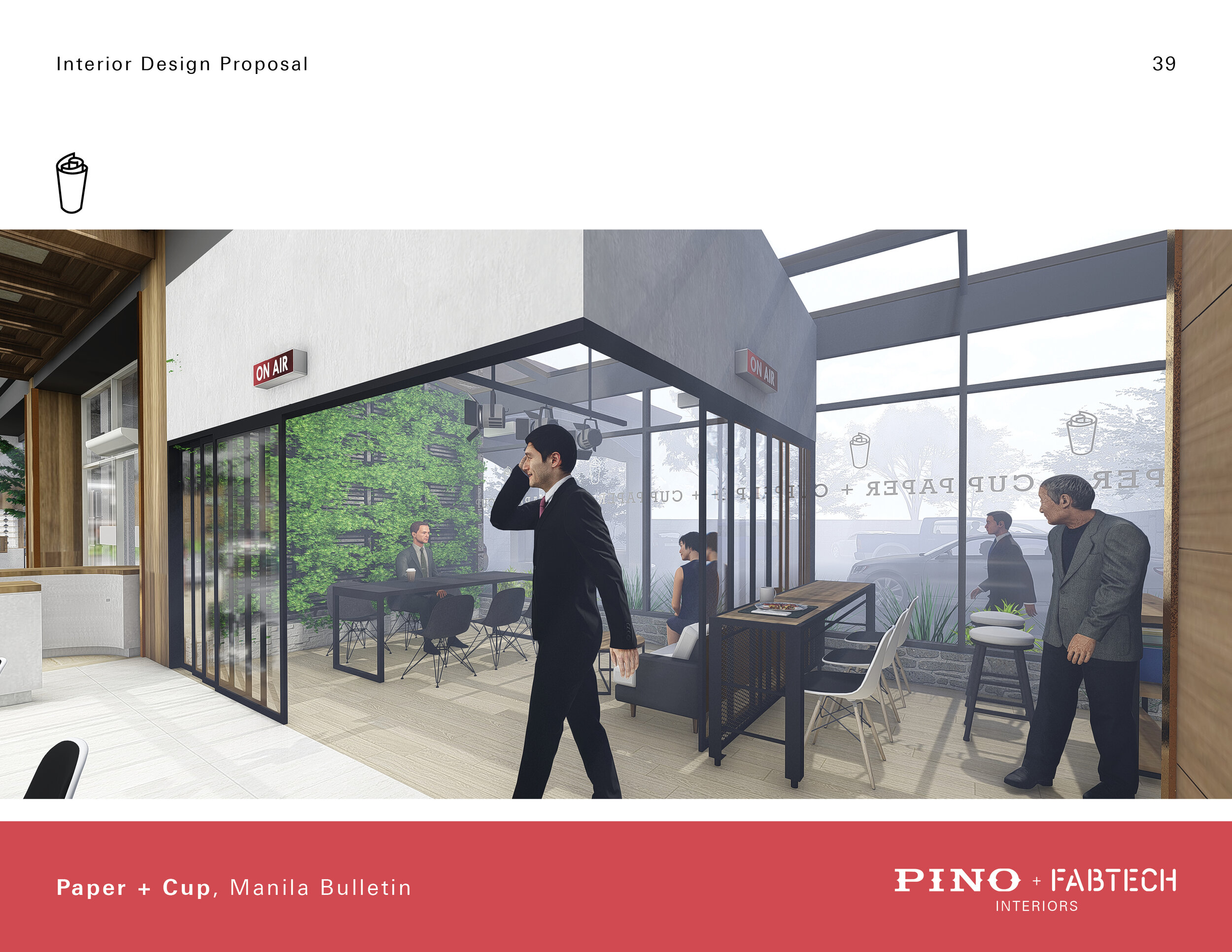
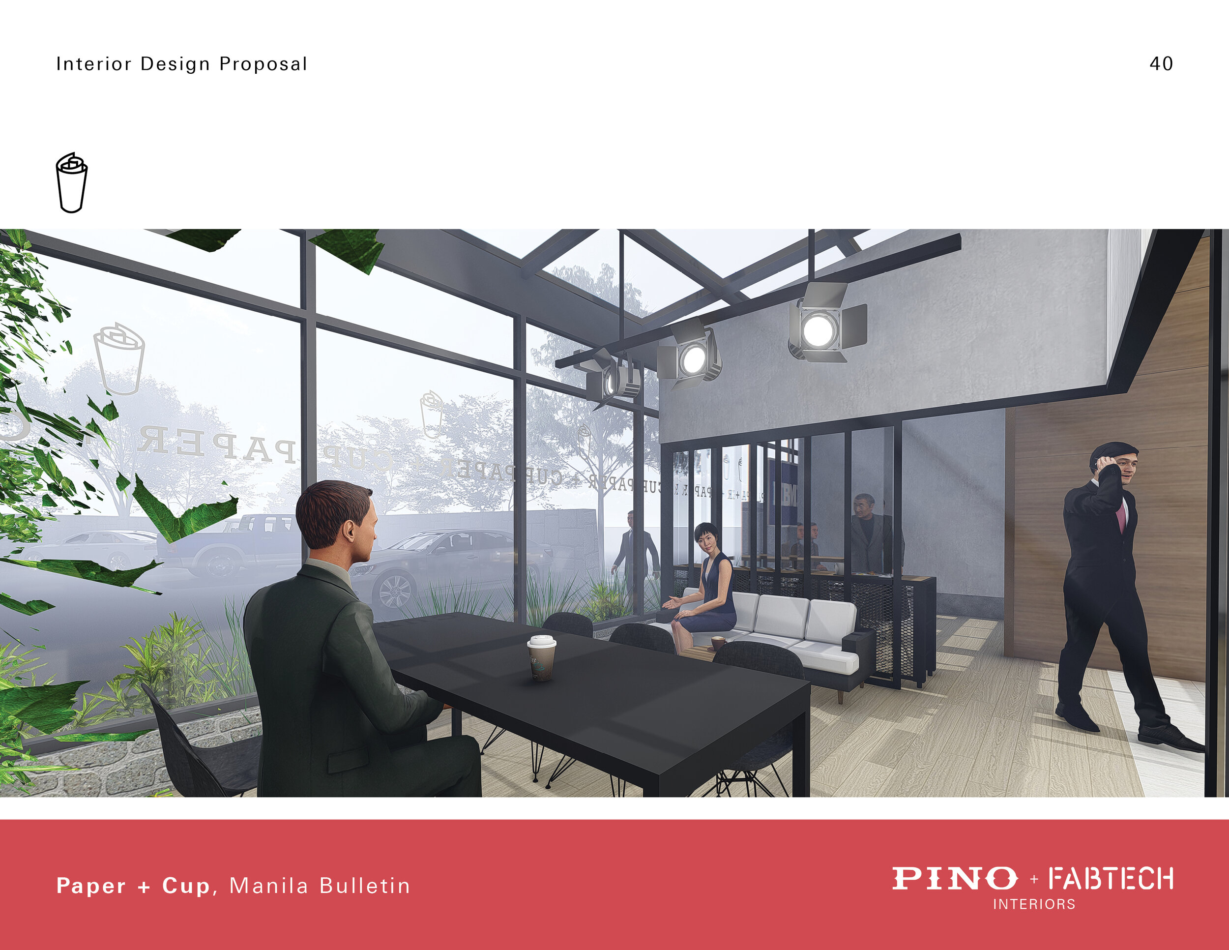
Garden Seating
The garden seating will create an intimate green space for its users to enjoy a relaxing cup of coffee.